


Hi everyone!
Welcome to the 27th issue of the Viz of the Week newsletter, where I'll be featuring a new visual each week and sharing the code behind it.
If you haven't subscribed and wish to receive these posts straight to your inbox, subscribe to join the community and receive free updates!
For this week, I wanted to recreate a very creative idea implemented by Sezer Unar, through which he visualizes a passing network in the shape of the solar system.
Excellent idea, right?
Here's the original tweet, which I think has code on how he did it in R.
Now it's a piece of cake for you! pic.twitter.com/KYgn2G2Hox
— Sezer Unar (@unarsezer) December 8, 2022
I loved the idea and final output of the plot, so I decided to give it a go with Python and some FA cup data.
Here's the result.
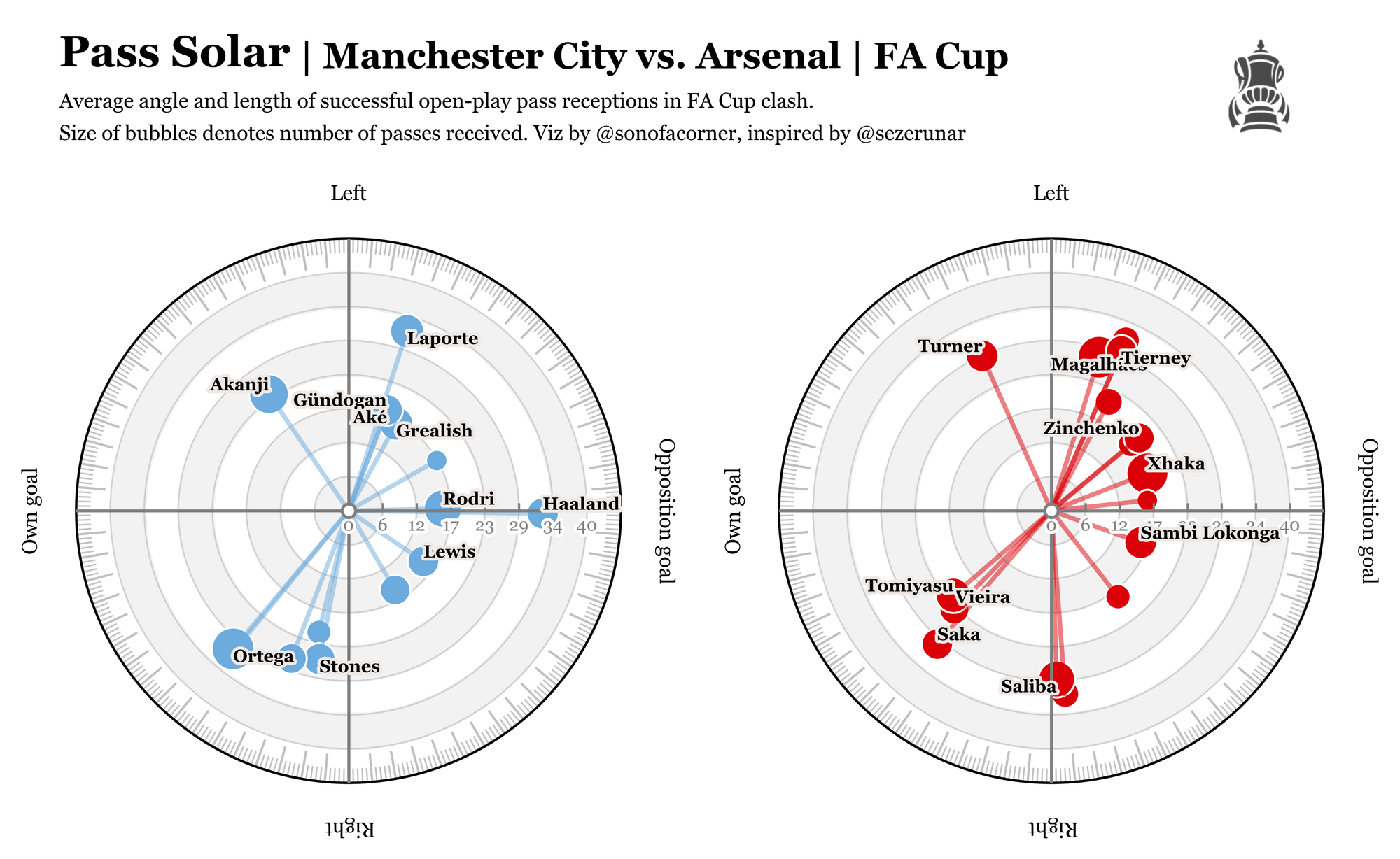
Although I liked the final output, I'm still dubious of its usefulness from an analytics perspective. Plus, the code was an absolute pain...(it was my first time doing a polar visual).
From Around the Grounds
Where are EPL teams winning the ball back by @_JKDS_
✨📊 Where are Premier League teams winning the ball back?
— JK (@_JKDS_) January 26, 2023
Teams ranked by the mean height up the pitch that they win possession back (directly from opposition). pic.twitter.com/71aAcM552d
Heat maps using Alteryx by CJ Mayes
I had the pleasure of sitting down with @Fuad9510 to talk about his #IronViz entry and the prep needed to produce soccer heatmaps in Tableau #SportsVizSundayhttps://t.co/XwZeYHpXr3
— CJ Mayes (@_CJMayes) January 24, 2023
The code
I hope you enjoyed today's post. As always, you're welcome to look at my code and reproduce the visual – although, please beware that it might be a bit nasty :/
All you need to do is check out my GitHub to get access to the notebook and the data behind it.
 sonofacorner