


Hi everyone!
Welcome to the 17th issue of the Viz of the Week newsletter, where I'll be featuring a new visual each week and sharing the code behind it.
I want to give a special welcome to the 14 new subscribers that joined this week. 🤍
If you haven't subscribed and wish to receive these posts straight to your inbox, subscribe to join the community and receive free updates!
This week I've gone for a more simple visual, but one which I've been wondering about doing for quite some time.
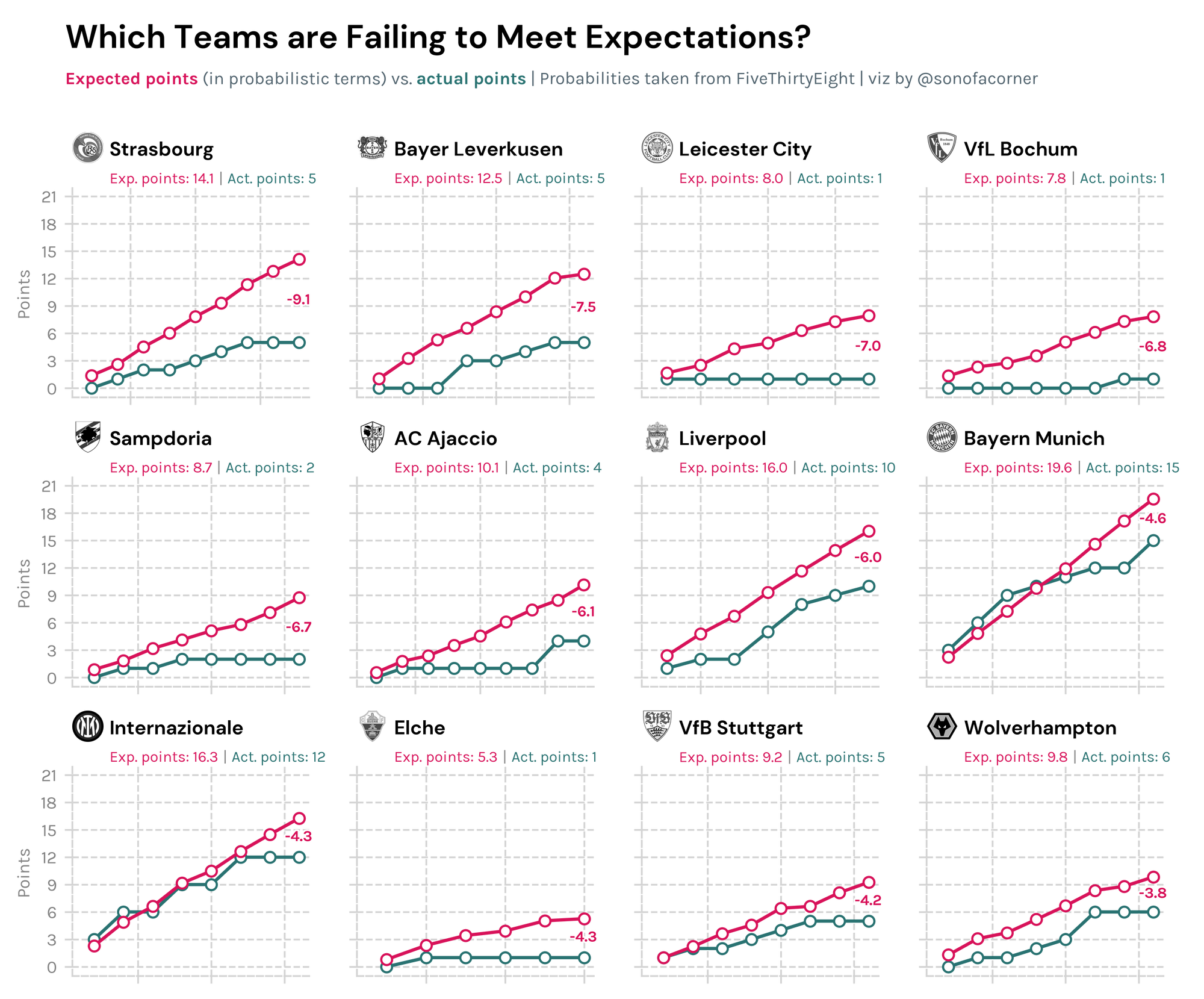
Which teams are doing worse than expected (in probabilistic terms)? That is, according to FiveThirtyEight's predictions, which teams have not gotten as many points as expected.
To compute this we simply take the expected value of each match, which is essentially a weighted average of the probabilities assigned by 538 and the points obtained in each outcome. In mathematical terms, it's defined as follows:
Expected Value = Prob (win) x 3 + Prob (tie) x 1 + Prob (lose) x 0
The following visual shows the twelve teams that have most underperformed their expected points in Europe's top five leagues. The results were quite surprising to be honest...
From Around the Grounds
Here are some of the cool things I saw from the community on Twitter this past week 😀
Expected Points blogpost by @TonyElHabr
This is by far a more advanced analysis of the topic explored in this week's newsletter, so I really recommend you give it a read if you're interested in the topic.
It's got some beautiful tables and even some R code for those interested in replicating the analysis.
what even is an "expected point"? i wrote blog posts showing how to:
— Tony (@TonyElHabr) September 10, 2022
1⃣ compute expected points (xPts) from expected goals (xG) without simulation
2⃣ compare xG sources using {worldfootballR}
3⃣ quantify how unlikely team placings were (🚨 2020/21 Brighton trigger warning 🚨) pic.twitter.com/Q9yYhs3lxa
Pass Sonars by Gareth Cooper
Gareth did an amazing visual showcasing Aston Villa's pass tendencies in this season's Premier League.
📊📈 @AVFCOfficial Pass Sonars 22/23 pic.twitter.com/m2DZBDbYST
— Gareth Cooper (@ThatGarateyjc) September 27, 2022
Central Progressing Historical Statistics by @UtdArena
A very interesting table on central progressions in the Premier League going all the way back to the 2012/2013 season.
Extremely clean visual with useful text annotations on the side that explain what the viz is about. I really should consider doing some of that on my own work.
Premier League central progressing from 2012/13 to 2021/22:@cesc4official = ridiculous. pic.twitter.com/uHc95IreiO
— UtdArena (@UtdArena) October 1, 2022
The code
I hope you enjoyed today's post. As always, you're welcome to take a look at my code and reproduce the visual.
If you get consistent value out of the site, consider becoming a paying member to support the improvement and content available on the website. I would really appreciate it!
All you need to do is check out my GitHub to get access to the notebook and the data behind it.


