


Bar charts are amongst the most straightforward visualizations out there. They're simple to understand, easy to create, and used almost everywhere.
However, simplicity comes at a cost. On countless occasions, I've seen inconsistent, misleading, and just straight-out horrible charts that could've gone right with a simple adjustment and an appropriate style guide.
Here are a couple of charts that should've never seen the light of day 👇
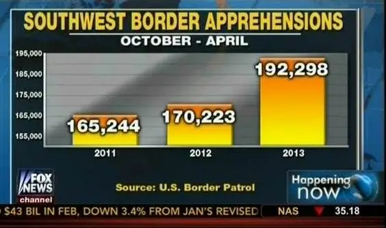
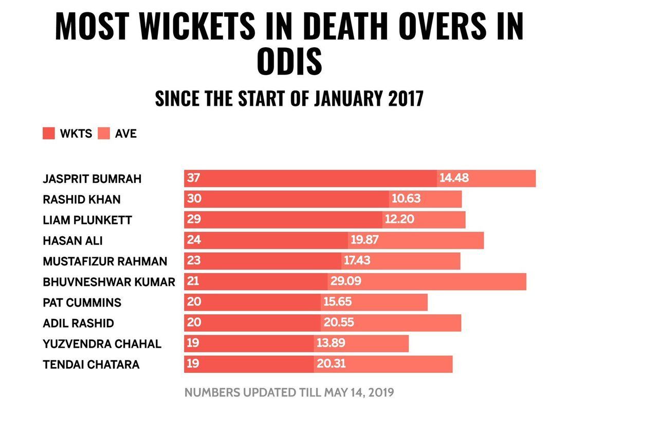
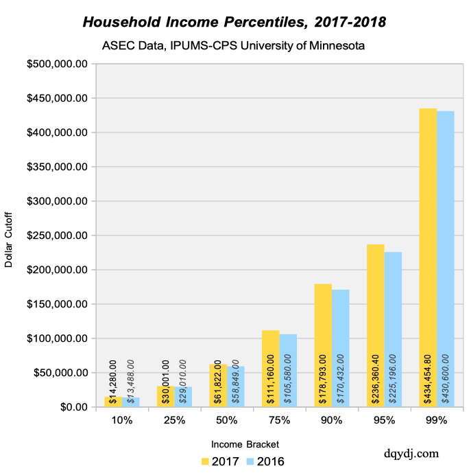
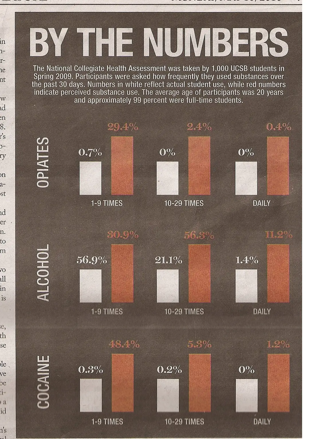
Poor ordering, inconsistent scales, mixed units, and non-zero-based scales are common mistakes I see on bar charts posted throughout the internet on a regular basis.
In this tutorial, I'll cover the basics of plotting beautiful bar charts using matplotlib without committing mistakes that might mislead your audience.
What we'll need
As in previous tutorials, I'll assume you have at least some basic understanding of matplotlib and pandas.
Let's import the libraries that we'll be using throughout the tutorial.
Note: if you're using Google Colab you should run the following line at the top of your notebook, to ensure we're using the same matplotlib version.
!pip install matplotlib --upgradeimport pandas as pd
import numpy as np
import matplotlib.pyplot as plt
import matplotlib.ticker as ticker
import matplotlib.patheffects as path_effectsThe data
For this tutorial, we'll go beyond the commonly used top-5 European leagues and explore Danish Superligaen data to switch things up a bit.
You can download the csv file, which contains foul data from the 2021/2022 season, from the following link:
df = pd.read_csv("superligaen_fouls_tutorial_06172022.csv", index_col = 0)Once you've loaded the dataset, it should look something like this.
|    |   match_id | date                | referee                       | variable   |   value | venue   |   team_id | team_name    |
|---:|-----------:|:--------------------|:------------------------------|:-----------|--------:|:--------|----------:|:-------------|
|  0 |    3597749 | 2021-07-25 07:00:00 | Aydin Uslu                    | fouls_for  |      15 | H       |     10202 | Nordsjælland |
|  1 |    3597749 | 2021-07-25 07:00:00 | Aydin Uslu                    | fouls_ag   |      14 | H       |     10202 | Nordsjælland |
|  2 |    3597742 | 2021-07-18 07:00:00 | Morten Krogh                  | fouls_for  |      12 | H       |     10202 | Nordsjælland |
|  3 |    3597742 | 2021-07-18 07:00:00 | Morten Krogh                  | fouls_ag   |      21 | H       |     10202 | Nordsjælland |
|  4 |    3597744 | 2021-07-18 09:00:00 | Mads-Kristoffer Kristoffersen | fouls_for  |       8 | H       |      8391 | FC København |
As you might infer, the dataset contains foul data on an individual match basis and includes both fouls drawn (fouls_ag) and conceded (fouls_for) by each team during the 2021/2022 season.
Bars, bars, and more bars
Now that we have the data we'll be working on; we can go ahead and start plotting.
To begin, let's group our data so we can take a look at which Danish sides conceded the most amount of fouls during the season.
fouls_per_team  = (
    df[df["variable"] == "fouls_for"]
    .groupby("team_name")
    ["value"]
    .sum()
    .reset_index()
)

X = fouls_per_team["team_name"]
height = fouls_per_team["value"]
And we do a simple bar plot.
fig = plt.figure(figsize=(6, 2.5), dpi = 200)
ax = plt.subplot(111)

ax.bar(X, height)

# Adjust ticks
ax.tick_params(axis = "x", rotation = 90)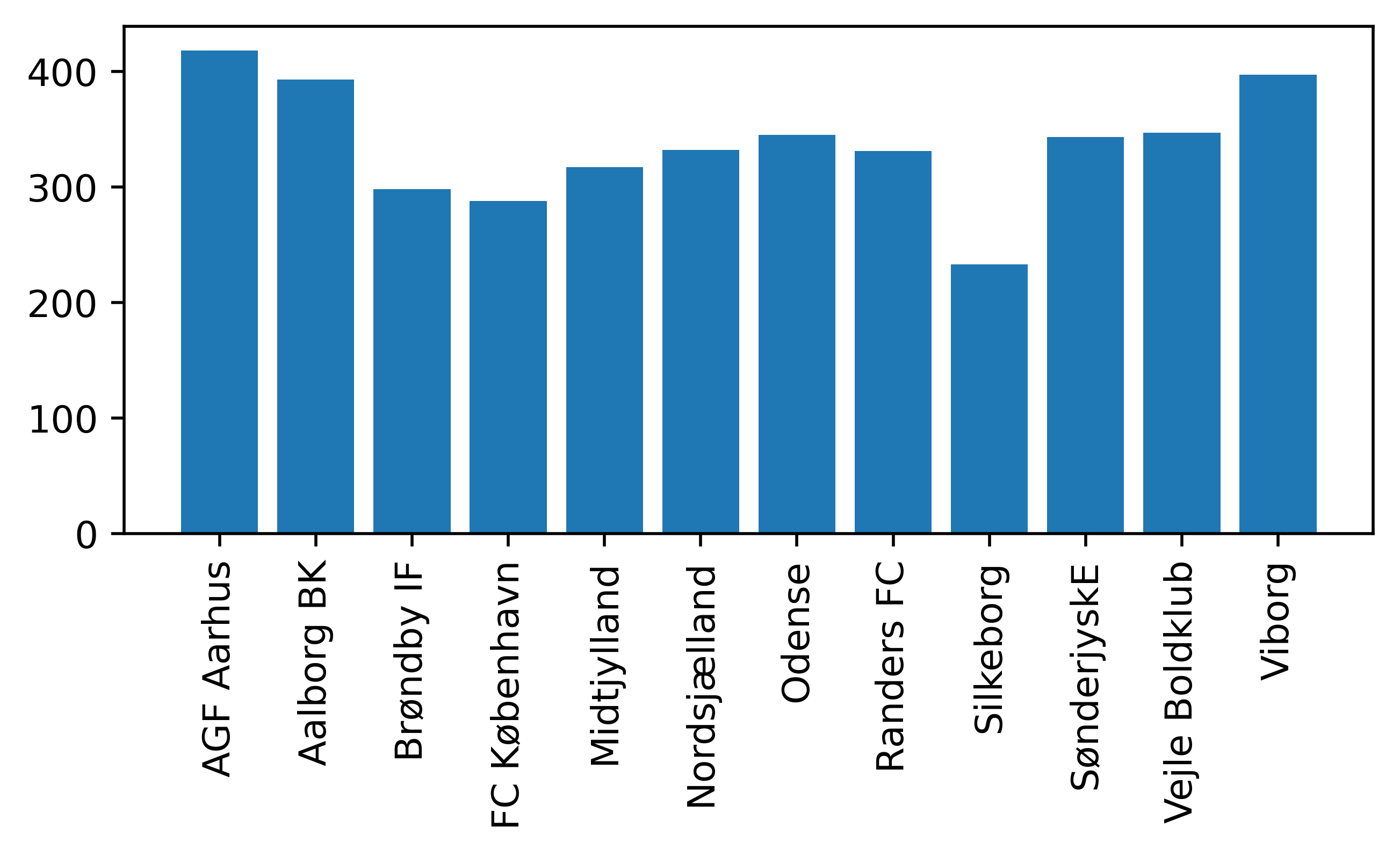
Order matters
As you can see from the previous visual, Viborg and Aarhus were the sides that committed the most amount of fouls during the season.
However, it might be difficult for the reader to figure out which of those sides was the naughtiest. Try to figure out which side ranked fourth, and you might need an aspirin from the headache.
That's why when doing bar charts, order matters – and it matters a lot.
One simple line of code and you can save your audience a fair amount of time on getting the overall picture of the data.
fouls_per_team = fouls_per_team.sort_values(by = "value", ascending = False)
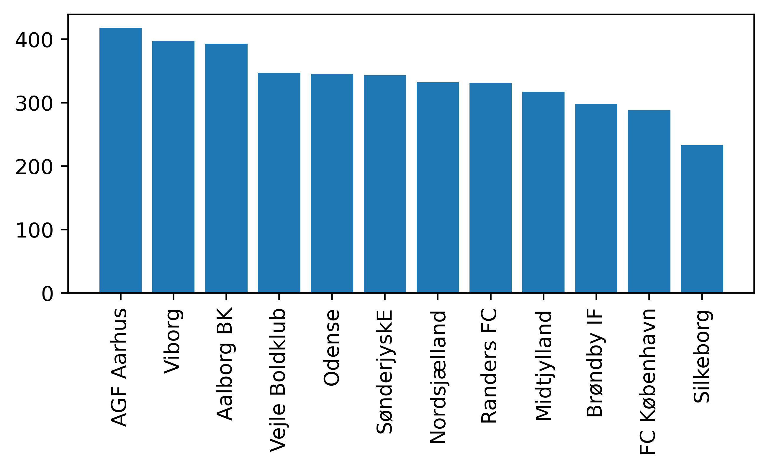
Fair play Silkeborg 🤝.
Making it pretty
Now it's time to tweak some settings and make our chart more aesthetically pleasing.
Let's begin by adjusting the spines, axis and the general aspect of the columns.
fig = plt.figure(figsize=(6, 2.5), dpi = 200, facecolor = "#EFE9E6")
ax = plt.subplot(111, facecolor = "#EFE9E6")

# Add spines
ax.spines["top"].set(visible = False)
ax.spines["right"].set(visible = False)

# Add grid and axis labels
ax.grid(True, color = "lightgrey", ls = ":")
ax.set_ylabel("Fouls conceded")

ax.bar(
	X,
    height,
    ec = "black",
    lw = .75,
    color = "#005a9b",
    zorder = 3,
    width = 0.75
)

# Adjust ticks
ax.tick_params(axis = "x", rotation = 90)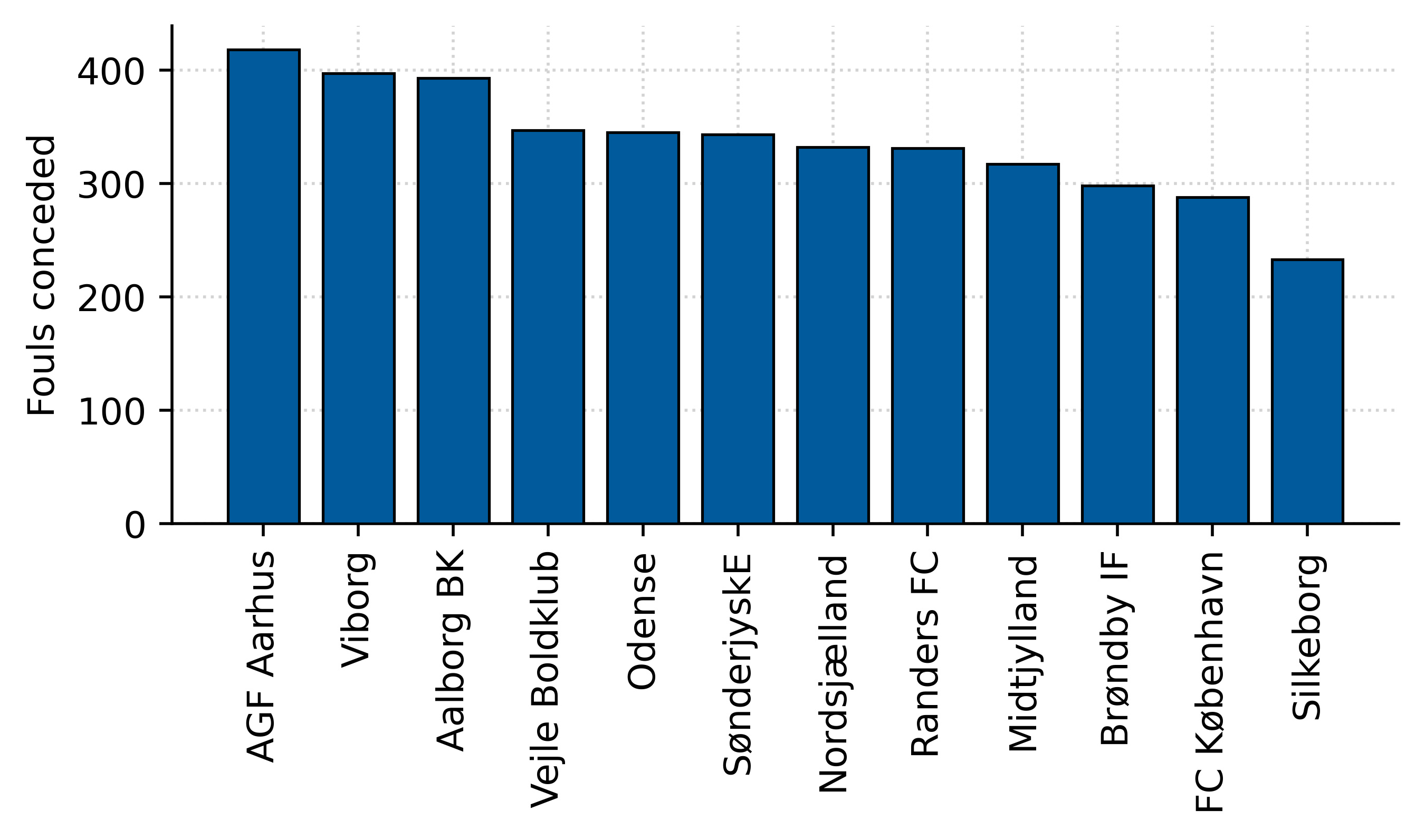
Perfect!
Stacking things up
Let's check if Danish teams committed more fouls when playing at home or on the road. To do this, we'll create a stacked chart and annotate the data in a way that's easy for the reader to visualize.
To start, let's create a new DataFrame and group data by venue.
Notice how I'm keeping the order of the columns consistent with our previous example by passing a list of sorted team names to the index of our new DataFrame.
fouls_per_team_venue  = (
    df[df["variable"] == "fouls_for"]
    .groupby(["team_name", "venue"])
    ["value"]
    .sum()
    .reset_index()
)

# We'll sort the values using the previous
# order.
sort_order = fouls_per_team["team_name"].to_list()
fouls_per_team_venue = fouls_per_team_venue.set_index("team_name")
fouls_per_team_venue = fouls_per_team_venue.loc[sort_order]
fouls_per_team_venue.reset_index(inplace = True)


height_h = (
    fouls_per_team_venue
    [fouls_per_team_venue["venue"] == "H"]["value"]
    .reset_index(drop = True)
)

height_a = (
    fouls_per_team_venue
    [fouls_per_team_venue["venue"] == "A"]["value"]
    .reset_index(drop = True)
)

# We'll annotate the x-axis differently.
X = np.arange(len(height_h))
Now it's time to do the chart. Here are some things to keep an eye on:
- The
bottomparameter on the second bar chart. This helps us stack our bar charts by specifying the lower baseline. - The
forloop is used to annotate the text exactly in the middle of each column. Notice how I compute the percentage of fouls committed on each venue directly on theannotatemethod by using the help of f-strings.
fig = plt.figure(figsize=(6, 2.5), dpi = 200, facecolor = "#EFE9E6")
ax = plt.subplot(111, facecolor = "#EFE9E6")

# Add spines
ax.spines["top"].set(visible = False)
ax.spines["right"].set(visible = False)

# Add grid and axis labels
ax.grid(True, color = "lightgrey", ls = ":")
ax.set_ylabel("Fouls conceded")

# Home fouls committed
ax.bar(
    X,
    height_h,
    ec = "black",
    lw = .75,
    color = "#005a9b",
    zorder = 3,
    width = 0.75,
    label = "Home"
)

# Away fouls committed (notice the bottom param)
ax.bar(
    X,
    height_a,
    bottom = height_h, # This creates the stacked chart
    ec = "black",
    lw = .75,
    color = "#f4a261",
    zorder = 3,
    width = 0.75,
    label = "Away"
)

ax.legend(
    ncol = 2,
    loc = "upper center",
    bbox_to_anchor = (0.45, 1.2),
    frameon = False
)

# Annotate the bar charts

aux_counter = 0
for y_h, y_a in zip(height_h, height_a):
    # annotate percentage of fouls in the center of the bar
    home_text = ax.annotate(
        xy = (aux_counter, y_h/2),
        text = f"{y_h/(y_h + y_a):.0%}", # F-strings are cool :)
        size = 7,
        ha = "center",
        va = "center",
        weight = "bold",
        color = "white",
        rotation = 90
    )

    away_text = ax.annotate(
        xy = (aux_counter, y_h + y_a/2), # Notice the sum of the bottom data.
        text = f"{y_a/(y_h + y_a):.0%}",
        size = 7,
        ha = "center",
        va = "center",
        weight = "bold",
        color = "white",
        rotation = 90
    )

    home_text.set_path_effects(
        [path_effects.Stroke(linewidth=1.75, foreground="black"), path_effects.Normal()]
    )

    away_text.set_path_effects(
        [path_effects.Stroke(linewidth=1.75, foreground="black"), path_effects.Normal()]
    )

    aux_counter += 1


# Adjust ticks
xticks_ = ax.xaxis.set_ticks(
    ticks = X,
    labels = sort_order,
    rotation = 90
)
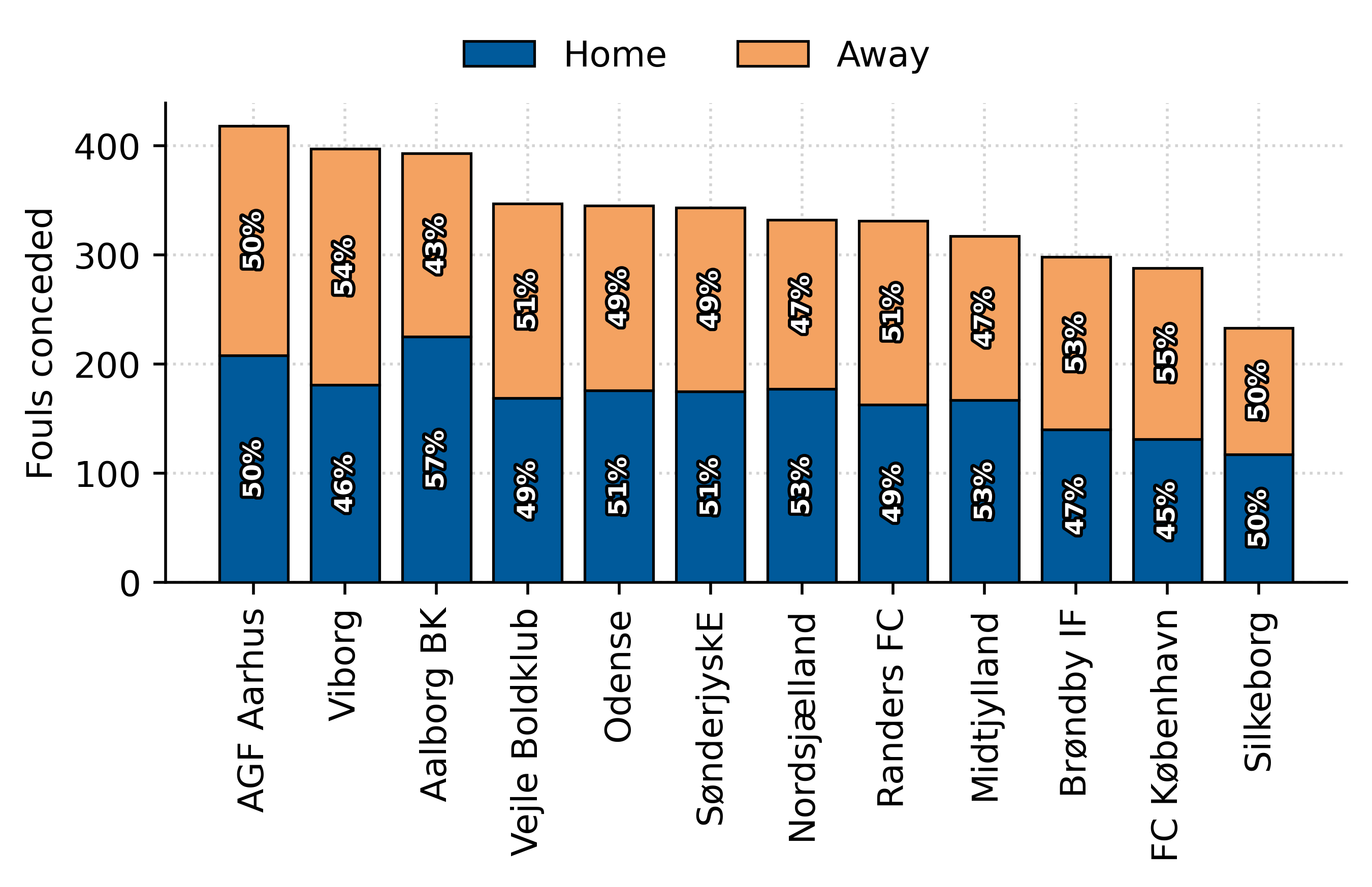
Sweet.
Placement and annotations
Although the colors and annotations make the chart more visually appealing, the data is not that interesting. Let's do another exercise on annotations and bar placement, but now we'll explore both fouls committed and conceded.
# Fouls conceded
fouls_per_team_c  = (
    df[df["variable"] == "fouls_for"]
    .groupby(["team_name"])
    ["value"]
    .sum()
    .reset_index()
)

# Fouls drawn
fouls_per_team_d  = (
    df[df["variable"] == "fouls_ag"]
    .groupby(["team_name"])
    ["value"]
    .sum()
    .reset_index()
)

# We'll use the fouls conceded as the main order.
fouls_per_team_c = fouls_per_team_c.sort_values(by = "value", ascending = False)

sort_order = fouls_per_team_c["team_name"].to_list()
fouls_per_team_d = fouls_per_team_d.set_index("team_name")
fouls_per_team_d = fouls_per_team_d.loc[sort_order]
fouls_per_team_d.reset_index(inplace = True)

# We define our series to be plotted
height_c = fouls_per_team_c["value"].reset_index(drop = True)
height_d = fouls_per_team_d["value"].reset_index(drop = True)

X = np.arange(len(height_c))
To plot side-by-side bar charts, we will need to do a trick on placing the x-axis' ticks positions.
The trick goes something like this:
- Specify the width of the columns.
- Draw the first series.
- Draw the second series, but dodge the placement on the x-axis by the width of the column. This will avoid any overlaps between both series.
- Place the ticks' position in the center of both columns by using
X + width/2.
fig = plt.figure(figsize=(6.5, 2.5), dpi = 200, facecolor = "#EFE9E6")
ax = plt.subplot(111, facecolor = "#EFE9E6")

# Add spines
ax.spines["top"].set(visible = False)
ax.spines["right"].set(visible = False)

# Add grid and axis labels
ax.grid(True, color = "lightgrey", ls = ":")


# We specify the width of the bar
width = 0.35

# Fouls conceded
ax.bar(
    X,
    height_c,
    ec = "black",
    lw = .75,
    color = "#005a9b",
    zorder = 3,
    width = width,
    label = "Fouls conceded"
)

ax.bar(
    X + width,
    height_d,
    ec = "black",
    lw = .75,
    color = "#f4a261",
    zorder = 3,
    width = width,
    label = "Fouls drawn"
)

ax.legend(
    ncol = 2,
    loc = "upper center",
    bbox_to_anchor = (0.45, 1.2),
    frameon = False
)

# Adjust ticks
xticks_ = ax.xaxis.set_ticks(
    ticks = X + width/2,
    labels = sort_order,
    rotation = 90
)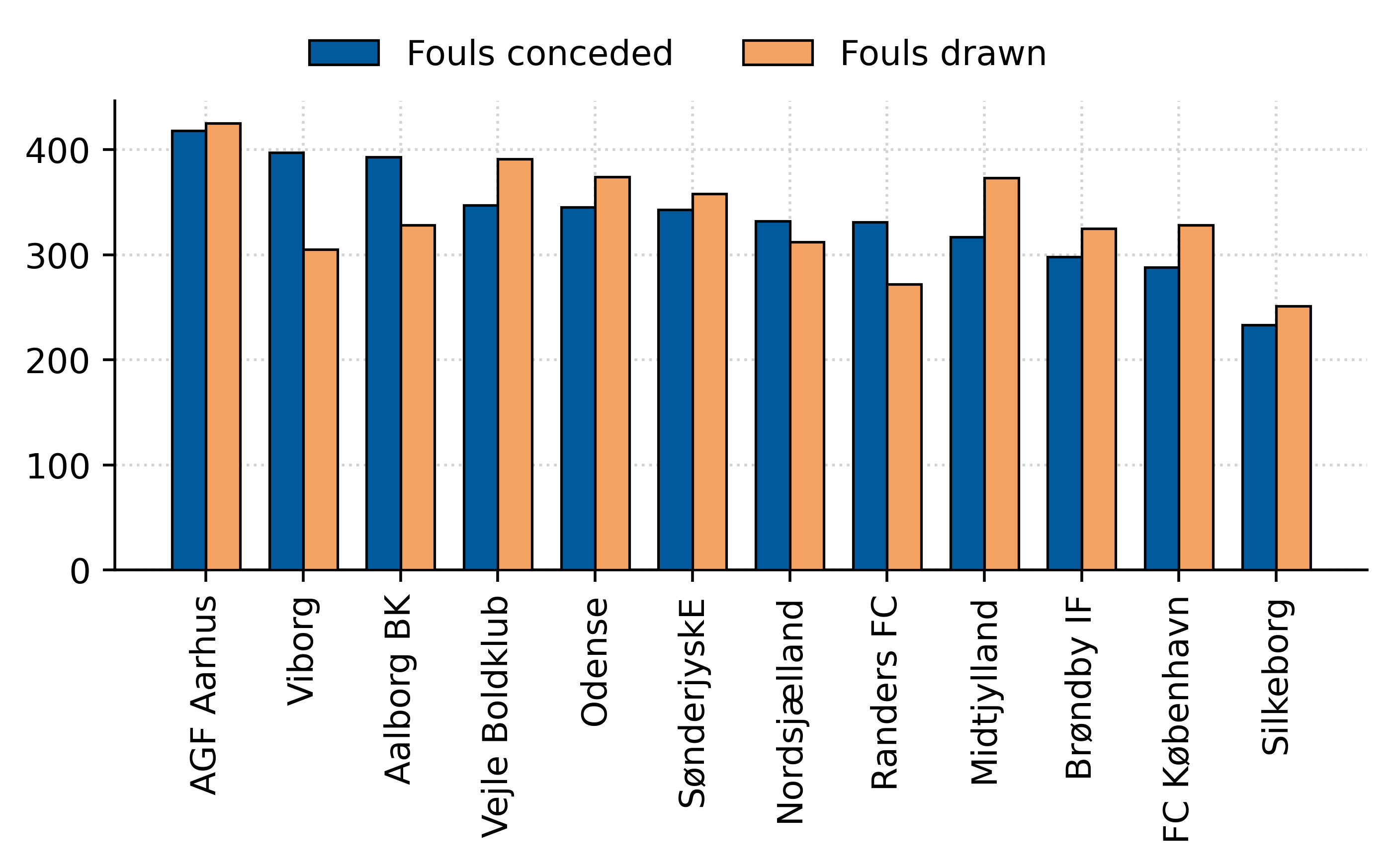
Cool 😎.
Let's recreate the same chart, but we'll plot the data as a ratio of fouls conceded to fouls drawn.
ratio_df = pd.DataFrame({
    "team_name": sort_order,
    "fouls_per_team_d": height_d,
    "fouls_per_team_c": height_c
})

ratio_df["ratio"] = ratio_df["fouls_per_team_c"]/ratio_df["fouls_per_team_d"]
ratio_df = ratio_df.sort_values(by = "ratio", ascending = False)

# We define our series to be plotted
height = ratio_df["ratio"].reset_index(drop = True)

X = np.arange(len(height))
fig = plt.figure(figsize=(6, 2.5), dpi = 200, facecolor = "#EFE9E6")
ax = plt.subplot(111, facecolor = "#EFE9E6")
# Add spines
ax.spines["top"].set(visible = False)
ax.spines["right"].set(visible = False)
# Add grid and axis labels
ax.grid(True, color = "lightgrey", ls = ":")
# We specify the width of the bar
width = 0.65
# Fouls conceded
ax.bar(
X,
height,
ec = "black",
lw = .75,
color = "#005a9b",
zorder = 3,
width = width,
label = "Fouls conceded"
)
# Annotate the ratio
for index, y in enumerate(height):
ax.annotate(
xy = (index, y),
text = f"{y:.2f}",
xytext = (0, 7),
textcoords = "offset points",
size = 7,
color = "#005a9b",
ha = "center",
va = "center",
weight = "bold"
)
xticks_ = ax.xaxis.set_ticks(
ticks = X,
labels = ratio_df["team_name"],
rotation = 90
)
This is an excellent example of where it might be tempting to commit a terrible mistake. The non-zero scaled base axis 😱.
Yes, it looks better. But it's misleading – notice how AGF seems to double Midtjylland's fouling ratio when in reality, those numbers are just 15% apart from each other.
So please, if you're doing a bar chart, always start with a zero-based axis.
Final showcase
For fun, let's finish off styling our bar chart with custom fonts and by adding team badges to our chart.
I won't go into detail on how this is done, but I recommend you spend some time reading the code, and I'm sure you'll get it.
First, some extra imports.
from PIL import Image
import urllib
import matplotlib.font_manager as fm
from highlight_text import fig_text
Some minor adjustments to the data.
# Merge to get team id's
ratio_df = pd.merge(ratio_df, df[["team_name", "team_id"]].drop_duplicates(), how = "left")

# Replace for abbreviated names.
ratio_df.replace({
    "team_name":{
        'Viborg': 'VFF',
        'Randers FC': 'RFC',
        'Aalborg BK': 'AaB',
        'Nordsjælland': 'FCN',
        'AGF Aarhus': 'AGF',
        'SønderjyskE': 'SON',
        'Silkeborg': 'SIF',
        'Odense': 'OB',
        'Brøndby IF': 'BIF',
        'Vejle Boldklub': 'VBK',
        'FC København': 'FCK',
        'Midtjylland': 'FCM'
    }
}, inplace = True)
And now the viz.
fig = plt.figure(figsize=(6, 2.5), dpi = 200, facecolor = "#EFE9E6")
ax = plt.subplot(111, facecolor = "#EFE9E6")

# Add spines
ax.spines["top"].set(visible = False)
ax.spines["right"].set(visible = False)

# Add grid and axis labels
ax.grid(True, color = "lightgrey", ls = ":")

# We specify the width of the bar
width = 0.5

# Fouls conceded
ax.bar(
    X,
    height,
    ec = "black",
    lw = .75,
    color = "#005a9b",
    zorder = 3,
    width = width,
    label = "Fouls conceded"
)

for index, y in enumerate(height):
    ax.annotate(
        xy = (index, y),
        text = f"{y:.2f}",
        xytext = (0, 7),
        textcoords = "offset points",
        size = 7,
        color = "#005a9b",
        ha = "center",
        va = "center",
        weight = "bold"
    )

xticks_ = ax.xaxis.set_ticks(
    ticks = X,
    labels = []
)

ax.tick_params(labelsize = 8)


# --- Axes transformations

DC_to_FC = ax.transData.transform
FC_to_NFC = fig.transFigure.inverted().transform

# Native data to normalized data coordinates
DC_to_NFC = lambda x: FC_to_NFC(DC_to_FC(x))

fotmob_url = "https://images.fotmob.com/image_resources/logo/teamlogo/"
for index, team_id in enumerate(ratio_df["team_id"]):
    ax_coords = DC_to_NFC([index - width/2, -0.25])
    logo_ax = fig.add_axes([ax_coords[0], ax_coords[1], 0.09, 0.09], anchor = "W")
    club_icon = Image.open(urllib.request.urlopen(f"{fotmob_url}{team_id:.0f}.png")).convert("LA")
    logo_ax.imshow(club_icon)
    logo_ax.axis("off")

    logo_ax.annotate(
        xy =(0, 0),
        text = f"({ratio_df['team_name'].iloc[index]})",
        xytext = (8.5, -25),
        textcoords = "offset points",
        size = 7,
        ha = "center",
        va = "center"
    )

fig_text(
    x = 0.12, y = 1.2,
    s = "Which Danish teams committed more fouls\nthan they received?",
    family = "DM Sans",
    weight = "bold",
    size = 13
)

fig_text(
    x = 0.12, y = 1,
    s = "Ratio of fouls conceded to fouls drawn for the 2021/2022 season | viz by @sonofacorner",
    family = "Karla",
    color = "grey",
    size = 8
)
Awesome! 🤩
If you enjoyed this tutorial, please help me out by subscribing to my website and sharing my work.
Catch you later 👋


