


Welcome to a new matplotlib tutorial.
If you've followed my work in recent weeks, you might find this article a bit different from what I usually write. However, I considered it was time to write something a little bit more technical that could help people gain more control over their data visuals.
Even though we will use (basic) football data for our examples, the main goal of this series of tutorials will be to explore the basic anatomy of a matplotlib figure and how its elements interact with each other.
As I wrote this tutorial, I noticed how long it could (potentially) get, so I decided to split it into parts. In this first piece, we'll be looking at how axes are added to a figure to help you gain more control of the layout of your plots.
Brief historical note
John Hunter and Michael Droettboom initially developed matplotlib in 2003 with the main purpose of replacing the Matlab graphics engine for scientific data visualization.
Its syntax and architecture were designed to feel familiar to Matlab users and to have enough flexibility to create high-quality figures that could be entirely customizable for the user's needs.
Despite the library receiving some unfair criticism in recent years, its architecture and syntax are extremely powerful to help you create any visualization you can think of. The problem is that people familiar with other popular data visualization tools such as ggplot , Tableau or Excel might find it a bit difficult, given matplotlib's low-level syntax.
However, once you've understood the basics, it's a fantastic tool to have control over and an enjoyable package to use on a day-to-day basis.
ℹ If you're a beginner, and have a Google account, you should be able to run this fairly easily using Google Colab.
Adding Axes
Let's start with the basics.
import matplotlib.pyplot as pltAs a bare minimum, a matplotlib figure should have a – you guessed it – figure.
You can think of a figure as the canvas of your visual. This canvas will contain everything you wish to put into your plot, such as one or multiple axes, which is the second most important element in matplotlib, since it defines the actual area where the data will be rendered.
The most basic way to get something on our screen is first to define a figure, and then draw an axes inside of it.
fig = plt.figure(figsize = (5,2))
# The rect parameter [left, bottom, width, height]
ax = fig.add_axes(
    rect = [0,0,1,1]
)

💡 Note: the rect parameter specifies the dimensions and positions of our axes.
For example, we can easily add another axes to our original plot to showcase the flexibility that matplotlib gives us regarding the placement of components.
fig = plt.figure(figsize = (5,2))
# The rect parameter [left, bottom, width, height]
ax = fig.add_axes(
    rect = [0,0,1,1]
)
# A centered axes on top of our original axes.
ax2 = fig.add_axes(
    rect = [.25,.25,.5,.5]
)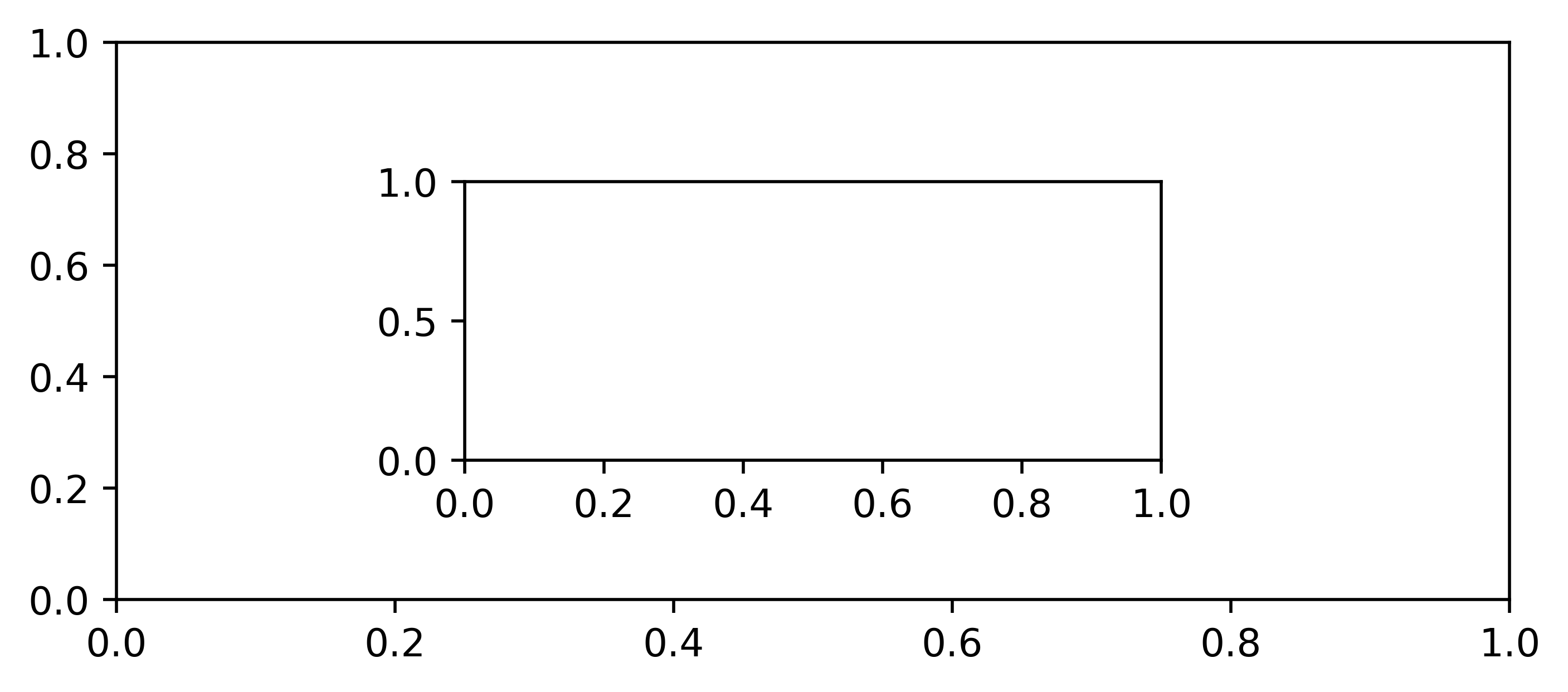
Notice how the second axes is perfectly centered in the middle of our figure. This is because I've specified it to have half the dimensions of our original axes and to have its left-bottom corner placed exactly at the (0.25, 0.25) position.
Even though adding axes with the add_axes method can be extremely useful. It's usually more convenient to add multiple axes via the subplot method – which is essentially another way of calling axes in matplotlib.
fig = plt.figure(figsize = (5,2))
'''
The position of the subplot described by one of three integers (nrows, ncols, index).
The subplot will take the index position on a grid with nrows rows and ncols columns.
The index starts at 1 in the upper left corner and increases to the right.
'''
ax = plt.subplot(121) # 1 row 2 columns, 1st position
ax2 = plt.subplot(122)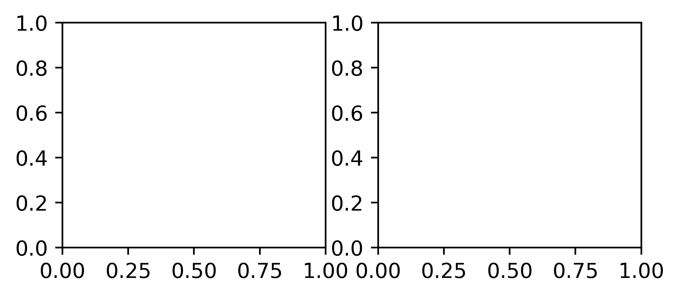
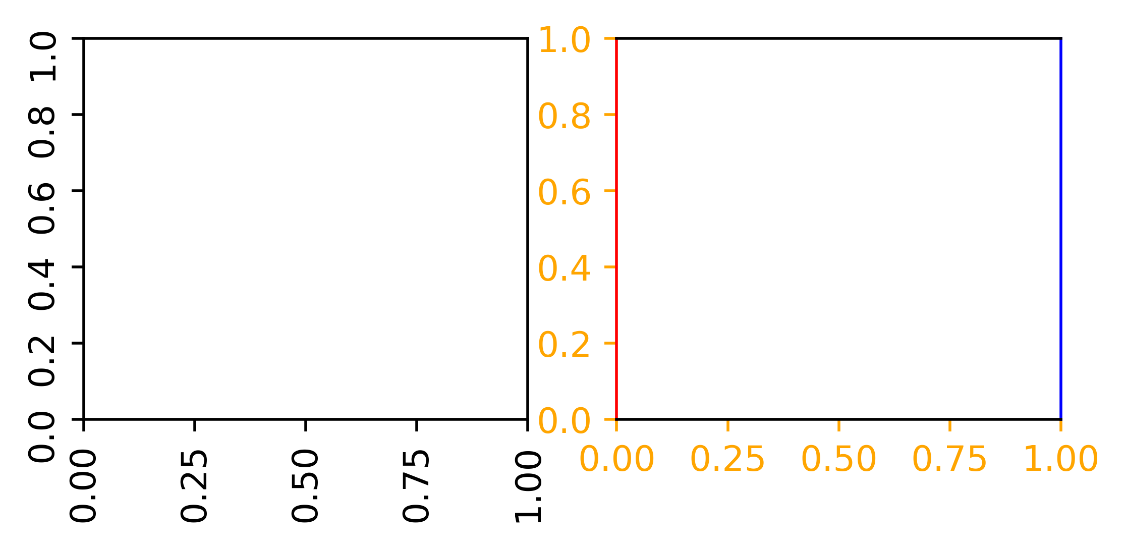
The beauty of having multiple axes on the same figure is that they are entirely independent. For example, we can customize our second axes ( ax2 ) to have a different edge color on its ticks and spines (the lines noting the data area boundaries) and our first axes ( ax1) to have rotated tick labels.
fig = plt.figure(figsize = (5,2))
ax1 = plt.subplot(121)
ax2 = plt.subplot(122)

# -- Customize ax1
ax1.tick_params(labelrotation = 90)

# -- Customize ax2
ax2.spines["left"].set_color("red")
ax2.spines["right"].set_color("blue")
ax2.tick_params(color = "orange", labelcolor = "orange")
The subplot_mosaic method
One of matplotlib's great features is the subplot_mosaic method, which allows us to easily specify the position of our axes in a very intuitive way. This method takes as input a list of strings that label the axes within our figure in a visual layout.
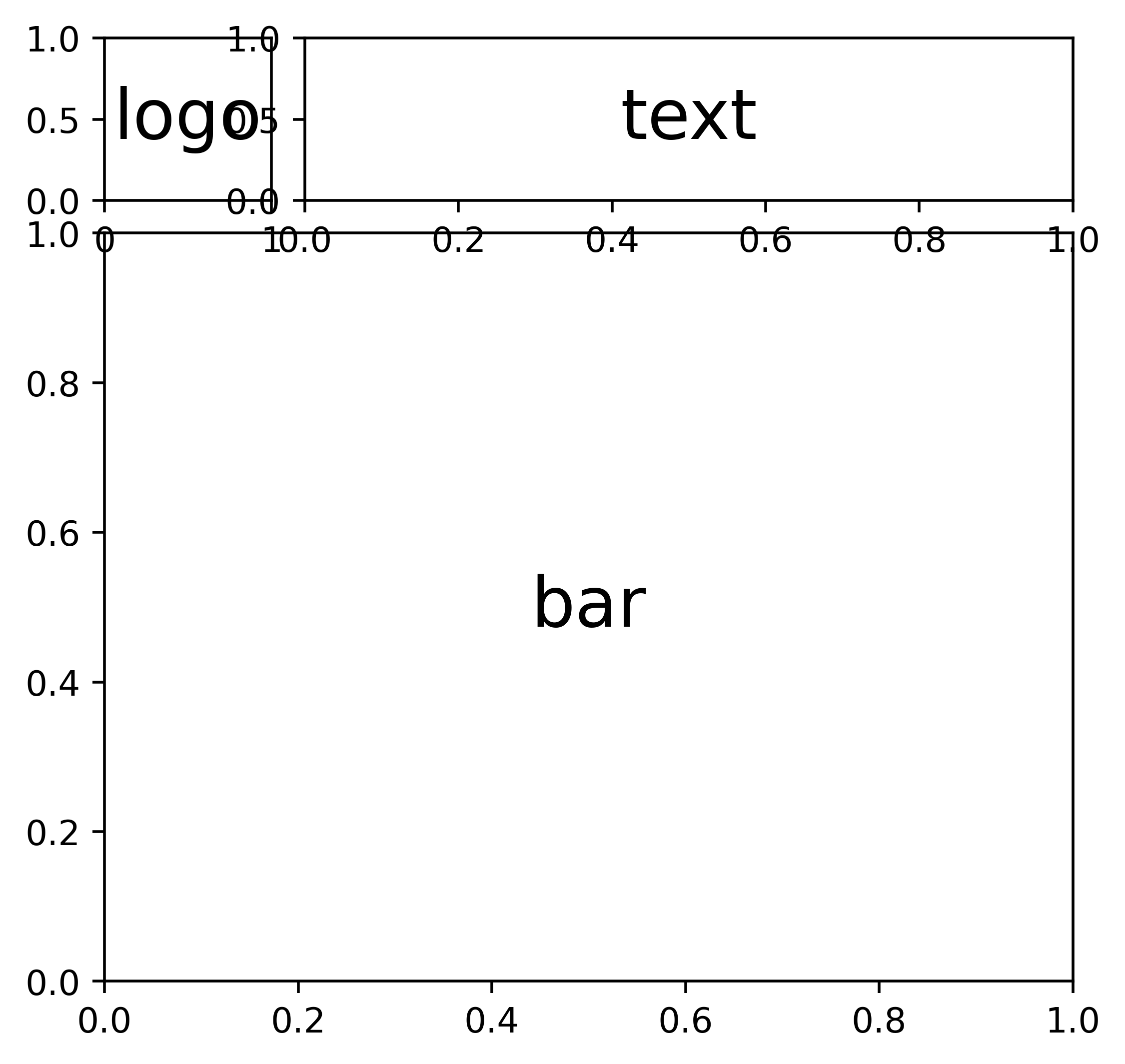
For example, let's say we're interested in creating a visual with an area for the title of our plot, a club's logo, and a bar chart. We could then specify the following list and pass it to the subplot_mosaic method to get the desired result.
# (4) elements: 2 rows and 2 columns
layout = [["logo", "text"],
          ["bar", "bar"]]
fig = plt.figure(figsize = (5,5))
ax_dict = fig.subplot_mosaic(
layout
)
ax_dict["logo"].annotate(
xy = (.5,.5),
text = "logo",
ha = "center",
va = "center",
size = 20
)
ax_dict["text"].annotate(
xy = (.5,.5),
text = "text",
ha = "center",
va = "center",
size = 20
)
ax_dict["bar"].annotate(
xy = (.5,.5),
text = "bar",
ha = "center",
va = "center",
size = 20
)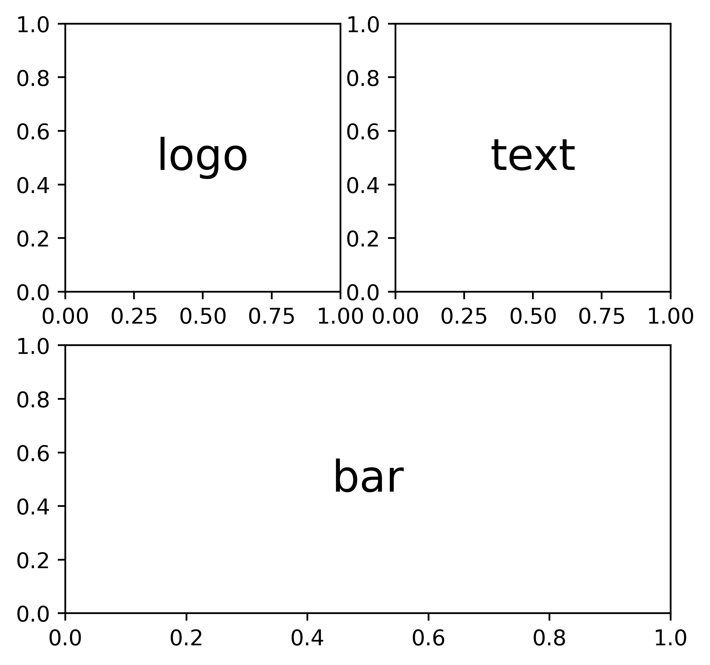
This might seem like a lot of work at first but look closely at the code to notice its simplicity. The layout list specifies the positions of each of our axes, which can now be accessed via their labels.
In essence, the "logo" axes is placed at the top-left position of our figure (spanning one row and one column), with the "text" axes placed beside it. Then, the "bar" axes is placed at the bottom, but it spans across two columns, as we declared it twice.
In this example, all of our axes have the same width and height. However, what if we wanted our logo and text to be one-fifth of the height of the bar chart? Or if we also wanted the logo to be one-fifth of the length of the plot's title?
We can do something similar to what we did in the previous example by adding four more rows and four more columns (with a neat Python trick).
layout = [["logo"] + ["text"] * 4,
          ["bar"] * 5,
          ["bar"] * 5,
          ["bar"] * 5,
          ["bar"] * 5]
fig = plt.figure(figsize = (5,5))
ax_dict = fig.subplot_mosaic(
layout
)
ax_dict["logo"].annotate(
xy = (.5,.5),
text = "logo",
ha = "center",
va = "center",
size = 20
)
ax_dict["text"].annotate(
xy = (.5,.5),
text = "text",
ha = "center",
va = "center",
size = 20
)
ax_dict["bar"].annotate(
xy = (.5,.5),
text = "bar",
ha = "center",
va = "center",
size = 20
)
And voila!
Now let's add some actual data to make our viz pop.
season = ["2005", "2006", "2007", "2008", "2009", "2010", "2011", "2012", "2013", "2014", "2015", "2016", "2017", "2018", "2019", "2020", "2021"]
points = [43, 42, 52, 50, 67, 71, 89, 78, 86, 79, 66, 78, 100, 98, 81, 86, 93]
We also import some extra libraries to get the logo.
import matplotlib.ticker as ticker
from PIL import Image
import urllib
fig = plt.figure(figsize = (7,5))
ax_dict = fig.subplot_mosaic(
layout
)
# -- Add the logo
fotmob_url = "https://images.fotmob.com/image_resources/logo/teamlogo/"
club_icon = Image.open(urllib.request.urlopen(f"{fotmob_url}{8456:.0f}.png"))
ax_dict["logo"].imshow(club_icon)
ax_dict["logo"].axis("off")
# -- Add the title
ax_dict["text"].annotate(
xy = (0, .5),
text = "Manchester City's points\nper season",
ha = "left",
va = "center",
weight = "bold",
size = 15
)
ax_dict["text"].axis("off")
# -- Add the bar chart
ax_dict["bar"].plot(season, points, marker = "o")
ax_dict["bar"].xaxis.set_major_locator(ticker.MultipleLocator(2))
# -- Customize the "bar" ax
ax_dict["bar"].spines["top"].set_visible(False)
ax_dict["bar"].spines["right"].set_visible(False)
ax_dict["bar"].set_ylim(0)
ax_dict["bar"].grid(visible = True, ls = ":", color = "gray")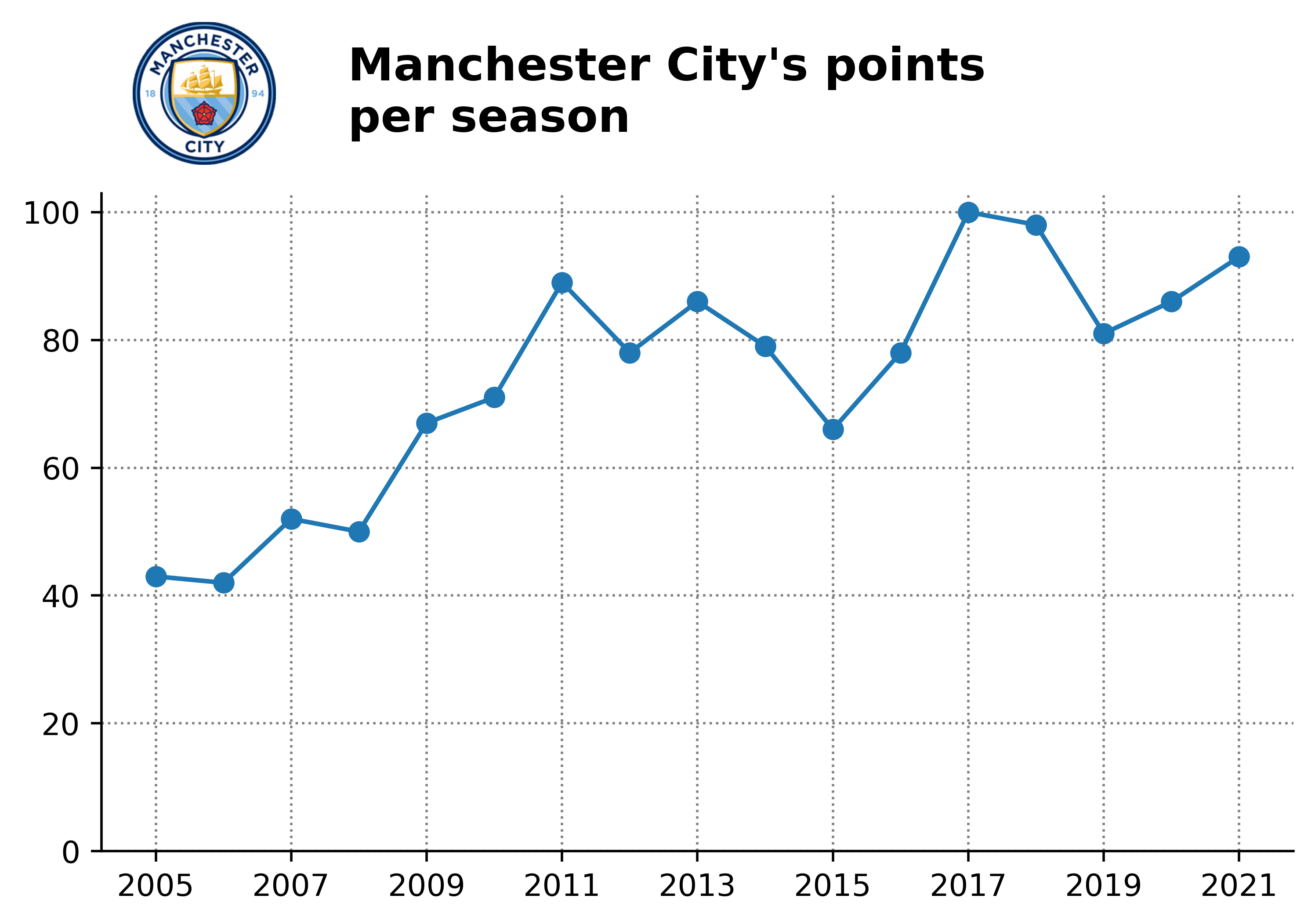
There you have it!
Let's do a brief recap:
- A
figureis our canvas. This contains everything we will be plotting. - An
axesis the area that actually renders the data – which can be anything from lines, bars, scatters, text, or images (and other things too). A figure can have multipleaxes, which are independent of each other. - The
add_axesmethod lets us add anaxesanywhere we want on our canvas by specifying its position, width, and height. - The
subplotmethod helps us addaxeseffortlessly by specifying their position on a grid of rows and columns. - Finally, the
subplot_mosaicmethod gives us more control by labeling ouraxesin an intuitive way. Plus, it lets us control the width and height for each of them with simple strings and labels.
As I mentioned, the goal of this tutorial was to give a basic idea of how to gain more control over your axes placement with matplotlib. So, I really hope you've learned something new.
You can expect a new edition of this series of tutorials every one (or two) weeks until we cover the very basics of matplotlib. So if you'd like to receive updates, make sure you're subscribed to the newsletter.
Please let me know on Twitter if this has helped you in any way, or if there's something that might be confusing – it really does help to create better content.
Thanks for reading.
Catch you later 👋


