


Creating beautiful tables in Python's matplotlib may seem like a daunting task. However, as you will see in this tutorial, tables are simply text and annotations placed in an ordered manner within a figure.
In this tutorial, we will learn how to make beautiful squad playing-time tables using La Liga data. The goal, however, is for you to take this step-by-step method into your own analysis and ideas to create other excellent visuals.
Before we go any further, I want to thank Tim Bayer, who published one of the first tutorials on the topic, and on which this post is greatly inspired.
What we'll need
import pandas as pd
import matplotlib.pyplot as plt

from PIL import Image
import urllib
import os
An Intro to How Tables Work
As Tim powerfully puts it in his tutorial, "tables are simply highly structured and organized scatterplots." This means that to create a simple table in matplotlib, all you need is text and a collection of x and y locations where you wish that data to be placed.
Let's look at a simple example.
# This is random data.
data = {
    'teams': ['Real Madrid', 'Barcelona', 'Villarreal', 'Sevilla'],
    'goals_scored': [23, 15, 28, 12]
}
fig = plt.figure(figsize=(4,3), dpi=200)
ax = plt.subplot(111)
ncols = 2
nrows = 4
ax.set_xlim(0, ncols)
ax.set_ylim(0, nrows)
ax.set_axis_off()
for y in range(0, nrows):
ax.annotate(
xy=(0.5,y),
text=data['teams'][y],
ha='center'
)
ax.annotate(
xy=(1.5,y),
text=data['goals_scored'][y],
ha='center'
)
ax.annotate(
xy=(0.5, nrows),
text='TEAM',
weight='bold',
ha='center'
)
ax.annotate(
xy=(1.5, nrows),
text='GOALS\nSCORED',
weight='bold',
ha='center'
)
plt.savefig(
'figures/a_very_basic_table.png',
dpi=300,
transparent=True
)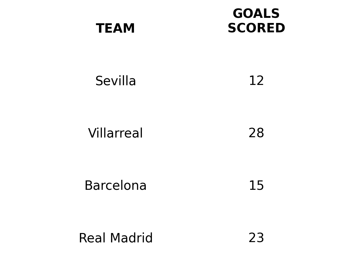
Not the most beautiful example, but helpful nonetheless.
Notice how we use for loops to iterate over each column in our dataset and place them under the same x position on the figure. This creates a table-like output on our figure.
Time to go into more detail.
Step 1. Define the dimensions of your table
This is the most crucial step.
How big is your table? How many columns and rows is it going to contain?
In my experience, the best way to do this is to have your DataFrame in a similar structure to your desired output. So, for starters, let's get into some actual data for this tutorial.
For this particular tutorial, I'll be using simple StatsBomb data via Fbref. Primarily because I want you to easily replicate this visual with the team of your choice, and secondly, because it's pretty straightforward to export a team's playing time data directly from Fbref's site.
Note: if you've never done this before, all you need is to go to the table of your choice and click on export CSV, then copy and paste that data into an empty notepad file and save it as your_file_name.csv
However, you can still follow along with the accompanying notebook and dataset I have provided on my GitHub.
Let's load that CSV file into our program.
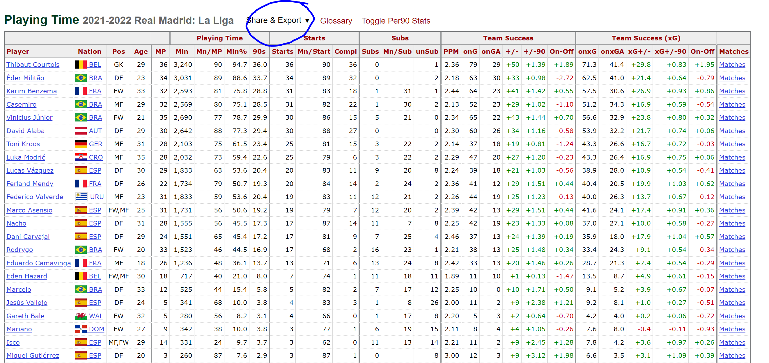
df = pd.read_csv('data/real_madrid_playing_time.csv', header=[1])
df
| | Player | Nation | Pos | Age | MP | Min | Mn/MP | Min% | 90s | Starts | Mn/Start | Compl | Subs | Mn/Sub | unSub | PPM | onG | onGA | +/- | +/-90 | On-Off | onxG | onxGA | xG+/- | xG+/-90 | On-Off.1 | Matches | -9999 |
|---:|:-----------------|:---------|:------|------:|-----:|------:|--------:|-------:|------:|---------:|-----------:|--------:|-------:|---------:|--------:|------:|------:|-------:|------:|--------:|---------:|-------:|--------:|--------:|----------:|-----------:|:----------|:---------|
| 0 | Thibaut Courtois | be BEL | GK | 29 | 36 | 3240 | 90 | 94.7 | 36 | 36 | 90 | 36 | 0 | nan | 1 | 2.36 | 79 | 29 | 50 | 1.39 | 1.89 | 71.3 | 41.4 | 29.8 | 0.83 | 1.95 | Matches | 1840e36d |
| 1 | Éder Militão | br BRA | DF | 23 | 34 | 3031 | 89 | 88.6 | 33.7 | 34 | 89 | 32 | 0 | nan | 2 | 2.18 | 63 | 30 | 33 | 0.98 | -2.72 | 62.5 | 41 | 21.4 | 0.64 | -0.79 | Matches | 2784f898 |
| 2 | Karim Benzema | fr FRA | FW | 33 | 32 | 2593 | 81 | 75.8 | 28.8 | 31 | 83 | 18 | 1 | 31 | 1 | 2.44 | 64 | 23 | 41 | 1.42 | 0.55 | 57.5 | 30.6 | 26.9 | 0.93 | 0.86 | Matches | 70d74ece |
| 3 | Casemiro | br BRA | MF | 29 | 32 | 2569 | 80 | 75.1 | 28.5 | 31 | 82 | 22 | 1 | 30 | 2 | 2.13 | 52 | 23 | 29 | 1.02 | -1.1 | 51.2 | 34.3 | 16.9 | 0.59 | -0.54 | Matches | 4d224fe8 |
| 4 | Vinicius Júnior | br BRA | FW | 21 | 35 | 2690 | 77 | 78.7 | 29.9 | 30 | 86 | 15 | 5 | 21 | 0 | 2.34 | 65 | 22 | 43 | 1.44 | 0.7 | 56.6 | 32.9 | 23.8 | 0.8 | 0.32 | Matches | 7111d552 |Ok, now that we have some data, we can then clean it to draw the visual.
For our first example, we'll begin by looking at players with more than a thousand minutes under their belt. For this sample, we'll look at the total of matches they were named in the squad and how many of them they played in.
df_example_1 = df[df['Min'] >= 1000].reset_index(drop=True)
df_example_1 = df_example_1[['Player', 'Pos', 'MP', 'Starts', 'Subs', 'unSub']]
| | Player | Pos | MP | Starts | Subs | unSub |
|---:|:-----------------|:------|-----:|---------:|-------:|--------:|
| 0 | Thibaut Courtois | GK | 36 | 36 | 0 | 1 |
| 1 | Éder Militão | DF | 34 | 34 | 0 | 2 |
| 2 | Karim Benzema | FW | 32 | 31 | 1 | 1 |
| 3 | Casemiro | MF | 32 | 31 | 1 | 2 |
| 4 | Vinicius Júnior | FW | 35 | 30 | 5 | 0 |Now that we have a simpler DataFrame we can now go ahead and add an additional column that will show the number of matches the player made it into the squad. As an extra step, we also sort the players based on the Starts column and filter the total columns by checking for NA in the Pos column.
df_example_1['InSquad'] = df_example_1['MP'] + df_example_1['unSub']
df_example_1 = df_example_1.sort_values(by='Starts').reset_index(drop=True)
df_example_1 = df_example_1[~df_example_1['Pos'].isna()]
Great, now we can go ahead and plot our first "useful" table.
As the section's name suggests, the main thing is to figure out the dimensions of our visual. For this, we first define which columns will become a part of our visual, which in this particular example, we'll only look at the following columns: ['Player', 'Pos', 'MP', 'Starts', 'InSquad'] . Second, we define the number of rows, which can be easily obtained by simply calling the number of rows in our DataFrame with the df_example_1.shape[0] method.
Take a look at the code below, and try to figure out how it works. If something's unclear, don't worry, we'll review it in detail later.
fig = plt.figure(figsize=(7,10), dpi=300)
ax = plt.subplot()

ncols = 5
nrows = df_example_1.shape[0]

ax.set_xlim(0, ncols + 1)
ax.set_ylim(0, nrows)

positions = [0.25, 2.5, 3.5, 4.5, 5.5]
columns = ['Player', 'Pos', 'MP', 'Starts', 'InSquad']

# Add table's main text
for i in range(nrows):
    for j, column in enumerate(columns):
        if j == 0:
            ha = 'left'
        else:
            ha = 'center'
        ax.annotate(
            xy=(positions[j], i),
            text=df_example_1[column].iloc[i],
            ha=ha,
            va='center'
        )

# Add column names
column_names = ['Player', 'Position', 'Matches\nPlayed', 'Starts', 'In Squad']
for index, c in enumerate(column_names):
        if index == 0:
            ha = 'left'
        else:
            ha = 'center'
        ax.annotate(
            xy=(positions[index], nrows),
            text=column_names[index],
            ha=ha,
            va='bottom',
            weight='bold'
        )

ax.set_axis_off()
plt.savefig(
    'figures/first_useful_table.png',
    dpi=300,
    transparent=True,
    bbox_inches='tight'
)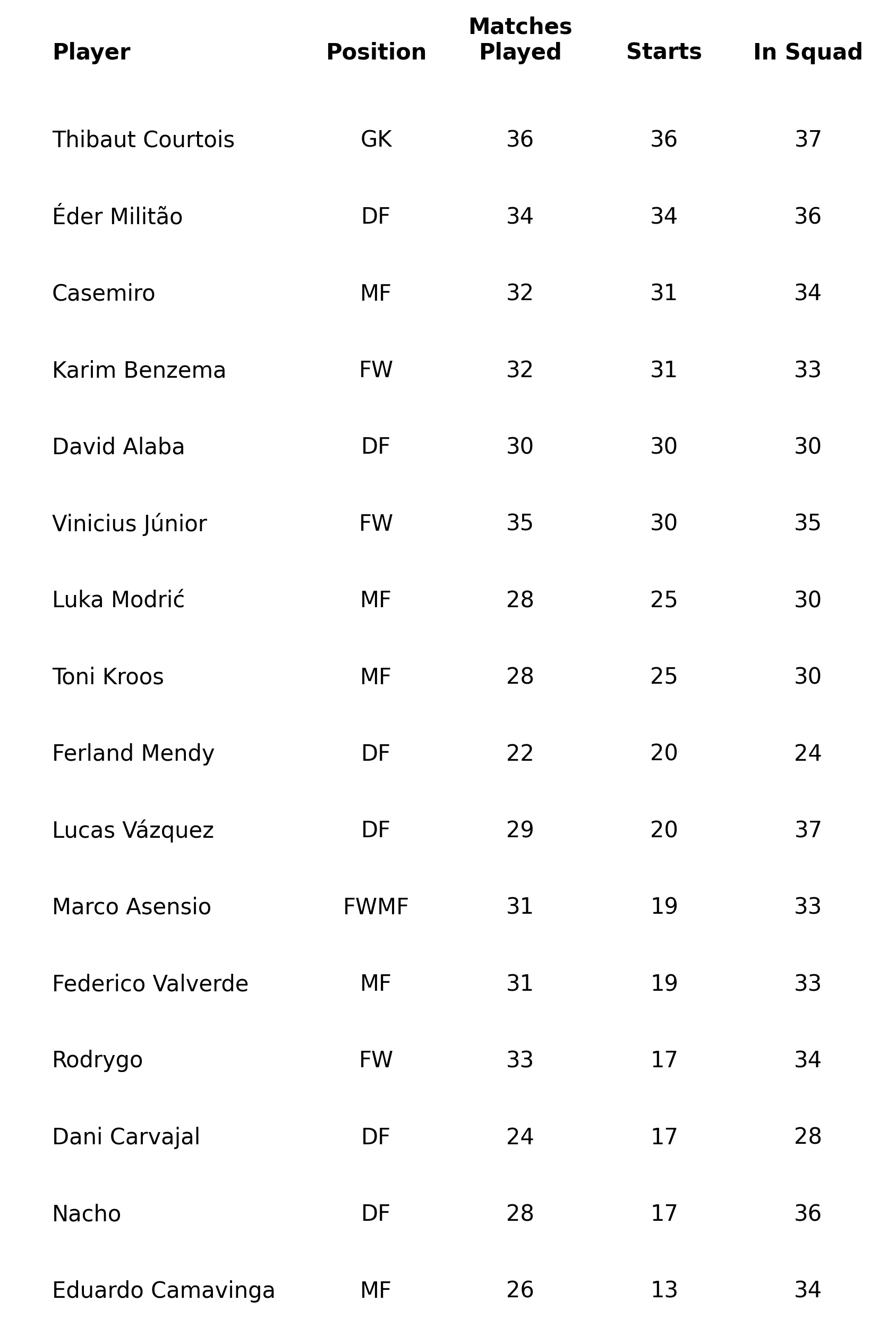
Let's summarize what we did:
- First, we define the dimensions of our table. The number of columns is hard-coded, whereas the number of rows is obtained from the size of our
DataFrame. Next, we limit the x and y axis based on these numbers and add an additional limit to the x-axis to give space for the player's names. - Next, we define a list with the positions of our columns. Again, this is hard-coded because it's difficult to know the actual space we need without looking at the data.
- Finally, we iterate over both columns and rows to place the text in the corresponding positions. The text is obtained with the
iloc[index]method directly from our selected column. We then repeat a similar process to add the column headers.
Step 2. Making it pretty
This is the hardest step, as it will depend on what type of data you're interested in visualizing. But for starters, we can add lines that divide the rows and headers in our table.
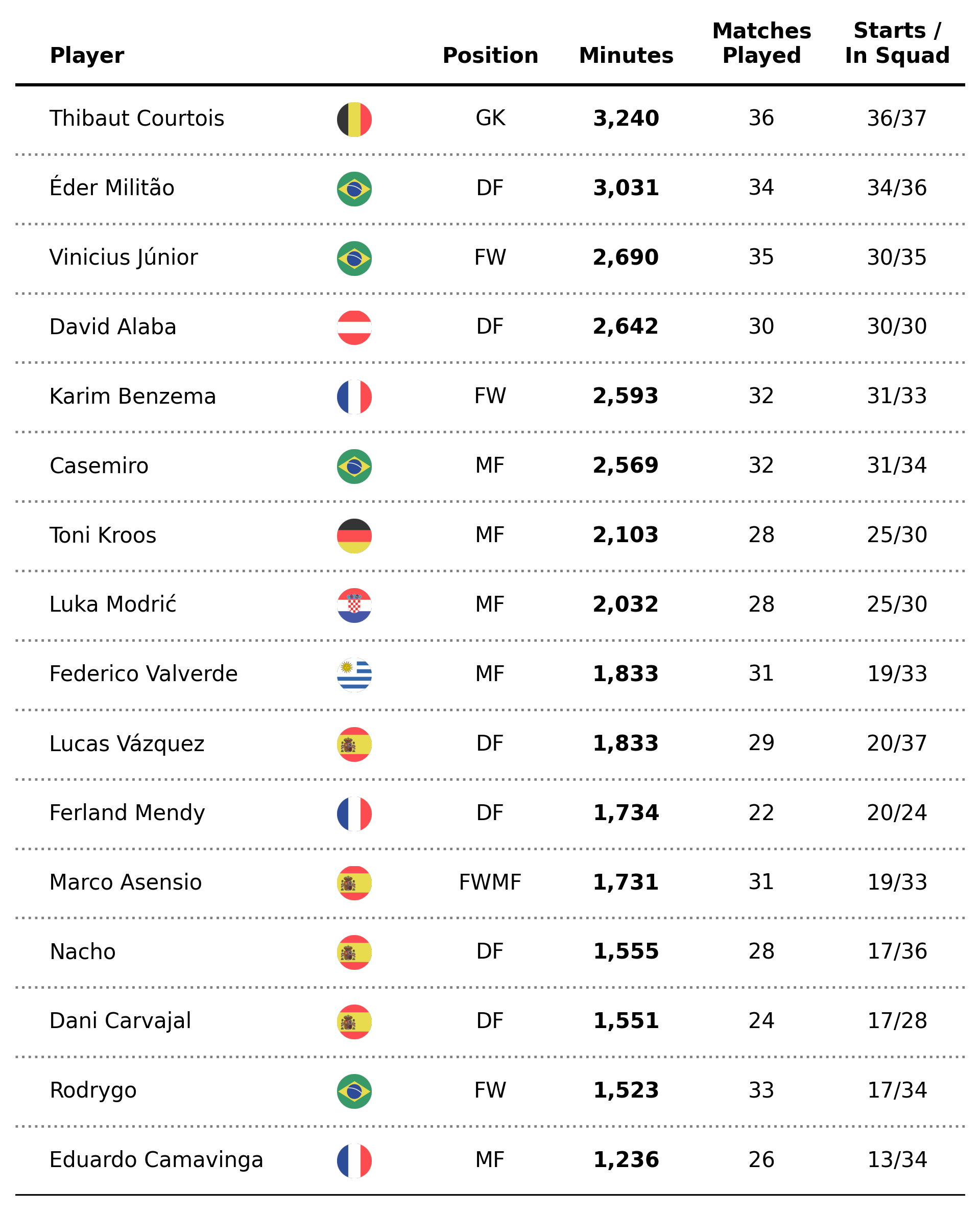
As an extra step, we'll change the visualization to showcase the number of minutes played as well as placing the Starts and InSquad data under the same column.
df_example_2 = df[df['Min'] >= 1000].reset_index(drop=True)
df_example_2 = df_example_2[['Player', 'Pos', 'Min', 'MP', 'Starts', 'Subs', 'unSub']]
df_example_2['InSquad'] = df_example_2['MP'] + df_example_2['unSub']
df_example_2 = df_example_2.sort_values(by='Min').reset_index(drop=True)
df_example_2 = df_example_2[~df_example_2['Pos'].isna()]
Great, now let's add a new column with our formatted string for the Starts and InSquad data.
df_example_2['Starts_InSquad'] = [f'{x}/{y}' for x,y in zip(df_example_2['Starts'], df_example_2['InSquad'])]Awesome. Now that we have that covered, let's get back to our table code.
fig = plt.figure(figsize=(7,10), dpi=300)
ax = plt.subplot()

ncols = 5
nrows = df_example_2.shape[0]

ax.set_xlim(0, ncols + 1)
ax.set_ylim(0, nrows + 1)

positions = [0.25, 2.5, 3.5, 4.5, 5.5]
columns = ['Player', 'Pos', 'Min', 'MP', 'Starts_InSquad']

# Add table's main text
for i in range(nrows):
    for j, column in enumerate(columns):
        if j == 0:
            ha = 'left'
        else:
            ha = 'center'
        if column == 'Min':
            text_label = f'{df_example_2[column].iloc[i]:,.0f}'
            weight = 'bold'
        else:
            text_label = f'{df_example_2[column].iloc[i]}'
            weight = 'normal'
        ax.annotate(
            xy=(positions[j], i + .5),
            text=text_label,
            ha=ha,
            va='center',
            weight=weight
        )

# Add column names
column_names = ['Player', 'Position', 'Minutes', 'Matches\nPlayed', 'Starts /\nIn Squad']
for index, c in enumerate(column_names):
        if index == 0:
            ha = 'left'
        else:
            ha = 'center'
        ax.annotate(
            xy=(positions[index], nrows + .25),
            text=column_names[index],
            ha=ha,
            va='bottom',
            weight='bold'
        )

# Add dividing lines
ax.plot([ax.get_xlim()[0], ax.get_xlim()[1]], [nrows, nrows], lw=1.5, color='black', marker='', zorder=4)
ax.plot([ax.get_xlim()[0], ax.get_xlim()[1]], [0, 0], lw=1.5, color='black', marker='', zorder=4)
for x in range(1, nrows):
    ax.plot([ax.get_xlim()[0], ax.get_xlim()[1]], [x, x], lw=1.15, color='gray', ls=':', zorder=3 , marker='')

ax.set_axis_off()
plt.savefig(
    'figures/pretty_example.png',
    dpi=300,
    transparent=True,
    bbox_inches='tight'
)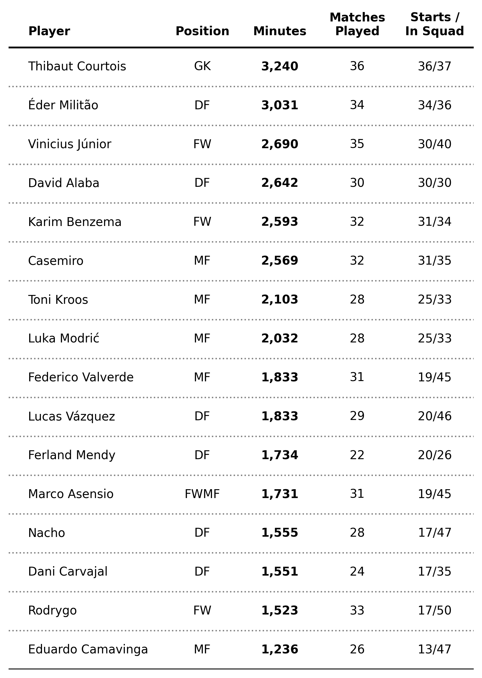
Much better right? So, what changed?
We adjusted the position of the annotations to place the text exactly in the middle of the cell. That is, instead of placing the text at, let's say, y = 3 we place it at y = 3.5. This is done so that the lines that we draw are placed under the text (alternatively, you could have adjusted the y position here instead).
To give our table more contrast, we also did a conditional on our first iteration so that when the column in the for loop equals Min we plot the corresponding text with a bold typeface.
Finally, we iterate once more over the number of rows and draw lines that span the whole length of our axes by making use of the ax.get_xlim() method. Notice how we have different lines for "grids" and borders, but the idea is essentially the same.
Time to get fancy
Our previous table is pretty cool. But in the end, the devil lies in the details, so let's go ahead and perform some extra steps to make this viz stunning (warning, the code might get a bit long).
Let's start by adding the nation of each player as an extra column.
df_final = df[df['Min'] >= 1000].reset_index(drop=True)
df_final = df_final[['Player', 'Nation', 'Pos', 'Min', 'MP', 'Starts', 'Subs', 'unSub']]
df_final['InSquad'] = df_final['MP'] + df_final['unSub']
df_final = df_final.sort_values(by='Min').reset_index(drop=True)
df_final = df_final[~df_final['Pos'].isna()]
df_final['Nation'] = [x.split(' ')[1].lower() for x in df_final['Nation']]
df_final['Starts_InSquad'] = [f'{x}/{y}' for x,y in zip(df_final['Starts'], df_final['InSquad'])]
Also, we define a function to get the flag of each nation, leveraging the fact that Fotmob has the nation's code as a team identifier.
def ax_logo(team_id, ax):
    '''
    Plots the logo of the team at a specific axes.
    Args:
        team_id (int): the id of the team according to Fotmob. You can find it in the url of the team page.
        ax (object): the matplotlib axes where we'll draw the image.
    '''
    fotmob_url = 'https://images.fotmob.com/image_resources/logo/teamlogo/'
    club_icon = Image.open(urllib.request.urlopen(f'{fotmob_url}{team_id}.png'))
    ax.imshow(club_icon)
    ax.axis('off')
    return ax
Sweet, now let's look at the core of the issue. We want to add axes at a specific position in our plot with dimensions defined in terms of data points. If you read my Figuring Figures Out tutorial you should already know the difference between figure and data coordinate systems, which come in extremely handy in situations such as this.
With the purpose of highlighting this issue, I'll only add the core chunk of code that adds the flags at a specific location, instead of the whole snippet. However, you can find the complete code at the end of this post and on the accompanying notebook.
# -- Transformation functions
DC_to_FC = ax.transData.transform
FC_to_NFC = fig.transFigure.inverted().transform
# -- Take data coordinates and transform them to normalized figure coordinates
DC_to_NFC = lambda x: FC_to_NFC(DC_to_FC(x))
# -- Add nation axes
ax_point_1 = DC_to_NFC([2.25, 0.25])
ax_point_2 = DC_to_NFC([2.75, 0.75])
ax_width = abs(ax_point_1[0] - ax_point_2[0])
ax_height = abs(ax_point_1[1] - ax_point_2[1])
for x in range(0, nrows):
    ax_coords = DC_to_NFC([2.25, x + .25])
    flag_ax = fig.add_axes(
        [ax_coords[0], ax_coords[1], ax_width, ax_height]
    )
    ax_logo(df_final['Nation'].iloc[x], flag_ax)
Ok, what are we doing here?
First, we define our transformation functions to map a data coordinate (i.e. the x and y positions of our plot in terms of the actual data) to a normalized figure coordinate (i.e. the corresponding x and y coordinates in terms of the fractional dimensions of our figure in pixels).
Then, I compute the width and height of our flag_ax by transforming two arbitrary points (in data coordinates) that have the desired width and height distance between them. Once transformed, we can then calculate that distance in terms of normalized figure coordinates and get our flag exactly as big as we want it.
Finally, we iterate over our rows and place the flag_ax with another coordinate transformation.
Pretty awesome 😍.
Ok, final step. Let's add a bar chart that represents the percentage of minutes each player played instead of our minutes' column. To do this, we first define a function that takes the number of minutes and creates a battery chart representing the percentage of total minutes played.
def minutes_battery(minutes, ax):
    '''
    This function takes an integer and an axes and
    plots a battery chart.
    '''
    ax.set_xlim(0,1)
    ax.set_ylim(0,1)
    ax.barh([0.5], [1], fc = 'white', ec='black', height=.35)
    ax.barh([0.5], [minutes/(90*38)], fc = '#00529F', height=.35)
    text_ = ax.annotate(
        xy=(minutes/(90*38), .5),
        text=f'{minutes/(90*38):.0%}',
        xytext=(-8,0),
        textcoords='offset points',
        weight='bold',
        color='#EFE9E6',
        va='center',
        ha='center',
        size=5
    )
    ax.set_axis_off()
    return ax
Now that we have that covered, we can go ahead and perform a similar exercise to what we did with the flag logos. Plus, some other nice details...
fig = plt.figure(figsize=(8,10), dpi=300)
ax = plt.subplot()

ncols = 6
nrows = df_final.shape[0]

ax.set_xlim(0, ncols + 1)
ax.set_ylim(0, nrows + 1)

positions = [0.25, 3.5, 4.5, 5.5, 6.5]
columns = ['Player', 'Pos', 'Min', 'MP', 'Starts_InSquad']

# -- Add table's main text
for i in range(nrows):
    for j, column in enumerate(columns):
        if j == 0:
            ha = 'left'
        else:
            ha = 'center'
        if column == 'Min':
            continue
        else:
            text_label = f'{df_final[column].iloc[i]}'
            weight = 'normal'
        ax.annotate(
            xy=(positions[j], i + .5),
            text=text_label,
            ha=ha,
            va='center',
            weight=weight
        )

# -- Transformation functions
DC_to_FC = ax.transData.transform
FC_to_NFC = fig.transFigure.inverted().transform
# -- Take data coordinates and transform them to normalized figure coordinates
DC_to_NFC = lambda x: FC_to_NFC(DC_to_FC(x))
# -- Add nation axes
ax_point_1 = DC_to_NFC([2.25, 0.25])
ax_point_2 = DC_to_NFC([2.75, 0.75])
ax_width = abs(ax_point_1[0] - ax_point_2[0])
ax_height = abs(ax_point_1[1] - ax_point_2[1])
for x in range(0, nrows):
    ax_coords = DC_to_NFC([2.25, x + .25])
    flag_ax = fig.add_axes(
        [ax_coords[0], ax_coords[1], ax_width, ax_height]
    )
    ax_logo(df_final['Nation'].iloc[x], flag_ax)

ax_point_1 = DC_to_NFC([4, 0.05])
ax_point_2 = DC_to_NFC([5, 0.95])
ax_width = abs(ax_point_1[0] - ax_point_2[0])
ax_height = abs(ax_point_1[1] - ax_point_2[1])
for x in range(0, nrows):
    ax_coords = DC_to_NFC([4, x + .025])
    bar_ax = fig.add_axes(
        [ax_coords[0], ax_coords[1], ax_width, ax_height]
    )
    minutes_battery(df_final['Min'].iloc[x], bar_ax)

# -- Add column names
column_names = ['Player', 'Position', '% of Min.\nPlayed', 'Matches\nPlayed', 'Starts /\nIn Squad']
for index, c in enumerate(column_names):
        if index == 0:
            ha = 'left'
        else:
            ha = 'center'
        ax.annotate(
            xy=(positions[index], nrows + .25),
            text=column_names[index],
            ha=ha,
            va='bottom',
            weight='bold'
        )

# Add dividing lines
ax.plot([ax.get_xlim()[0], ax.get_xlim()[1]], [nrows, nrows], lw=1.5, color='black', marker='', zorder=4)
ax.plot([ax.get_xlim()[0], ax.get_xlim()[1]], [0, 0], lw=1.5, color='black', marker='', zorder=4)
for x in range(1, nrows):
    ax.plot([ax.get_xlim()[0], ax.get_xlim()[1]], [x, x], lw=1.15, color='gray', ls=':', zorder=3 , marker='')

ax.fill_between(
    x=[0,2],
    y1=nrows,
    y2=0,
    color='lightgrey',
    alpha=0.5,
    ec='None'
)

ax.set_axis_off()
# -- Final details
logo_ax = fig.add_axes(
    [0.825, 0.89, .05, .05]
)
ax_logo(8633, logo_ax)
fig.text(
    x=0.15, y=.91,
    s='Real Madrid 2021/2022 Squad Playing Time',
    ha='left',
    va='bottom',
    weight='bold',
    size=12
)
plt.savefig(
    'figures/final_table.png',
    dpi=300,
    transparent=True,
    bbox_inches='tight'
)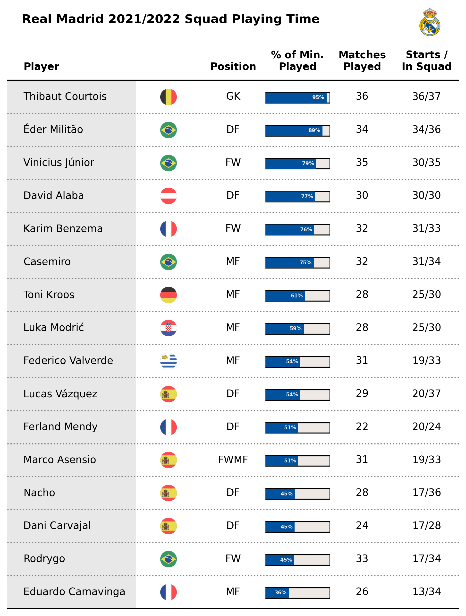
That's a wrap!
As you can see, having control of different coordinate systems in matplotlib is essential to create these types of visualizations, so if you haven't read it yet I really recommend you have a look at my Figuring Figures Out tutorial series.
If you enjoyed this tutorial, please help me by sharing my work and subscribing to the newsletter so you can receive a new visual each Monday with the code behind it.
Enjoy your Sunday! 😊


