


Welcome to a new matplotlib tutorial.
This is the second piece of the Figuring Figures Out tutorial series, where we explore more technical concepts regarding the anatomy of matplotlib figure objects.
The first piece of the series explored the different ways that axes are added to a figure. If it's your first time here, maybe it's a good idea to start off there and then come back.
In this second part, we'll explore the different coordinate systems within a figure and how you can exploit them to create amazing visuals.
💡 I've supplied an accompanying notebook for this tutorial which you can check out on my GitHub.
An Intro to Coordinate Systems in Matplotlib
Have you ever wondered why some text annotations or images are hard to place at a specific location within a matplotlib figure?
This is because matplotlib has multiple coordinate systems, with the two most important ones being figure and data coordinates. To make things even more complex, each system has a normalized and native version that allows you to control the positioning of the plot's elements in different ways.
The main goal of this post is to shed some light on how these work and to try and make the issue less complicated. Once you've understood the basics, I'm sure you'll be able to apply them in interesting ways to your work.
Personal note: this has been by far the hardest tutorial I've had to write so far, but it's the one from which I've learned the most about matplotlib's complexities.
Imports
Please note that I'm using the 3.5.2 matplotlib version.
import pandas as pd
import matplotlib.pyplot as plt
import matplotlib.ticker as ticker
from matplotlib.transforms import ScaledTranslation

from PIL import Image
import urllib
import os
Figure Dimensions
One thing I struggled with when starting when matplotlib was that I never knew how to control the actual dimensions of the plot I was creating.
Knowing the actual size of your plot (in pixels), is actually pretty important. For example, knowing the "pixel size" of your plot is essential to secure that the text in your visual doesn't look too small, or too big; or that you don't create unnecessary huge figures.
So here's how this works:
- When you create a
figurethefigsizeparameter specifies the dimensions of yourfigurein inches. - The
dpiparameter denotes the dots per inch of yourfigure, where a higherdpiresults in a higher resolution.
As a result, the dimensions of the figure (in pixels) will be the dpi times the width and height of the plot. For example, the following code creates a 1500 x 1500 sized picture since we assign a dpi of 300 and a figsize = (5, 5).
fig = plt.figure(figsize=(5,5), dpi=300)
ax = plt.subplot()
Cool, right?
The Data Coordinate System
This is the most basic coordinate system in matplotlib and is usually the default when plotting things in Python.
As the name suggests, the data coordinate system's native version is expressed in terms of the data. That is, it depends on the actual x and y limits of your plot's axes. On the other hand, it maps the width and height of the axes to a scale of between 0 and 1 in its normalized version.
The normalized version is useful as it allows us to specify the position of certain elements within the axes, without having to worry about the underlying data of our visualization.
Let's look at a very simple example.
fig = plt.figure(figsize=(5,5), dpi=300)
ax = plt.subplot()

ax.set_xlim(0,100)
ax.set_ylim(0,1000)


# -- Annotations --------------------------------
ax.annotate(
    xy=(70,800),
    text='This text is placed using\ndata coordinates',
    ha='center', va='center'
)

ax.annotate(
    xy=(.5,.5),
    text='This text is placed using\nnormalized data coordinates',
    ha='center', va='center',
    xycoords='axes fraction'
)

plt.savefig(
    'figures/data_coordinates.png',
    dpi=300,
    transparent=True
)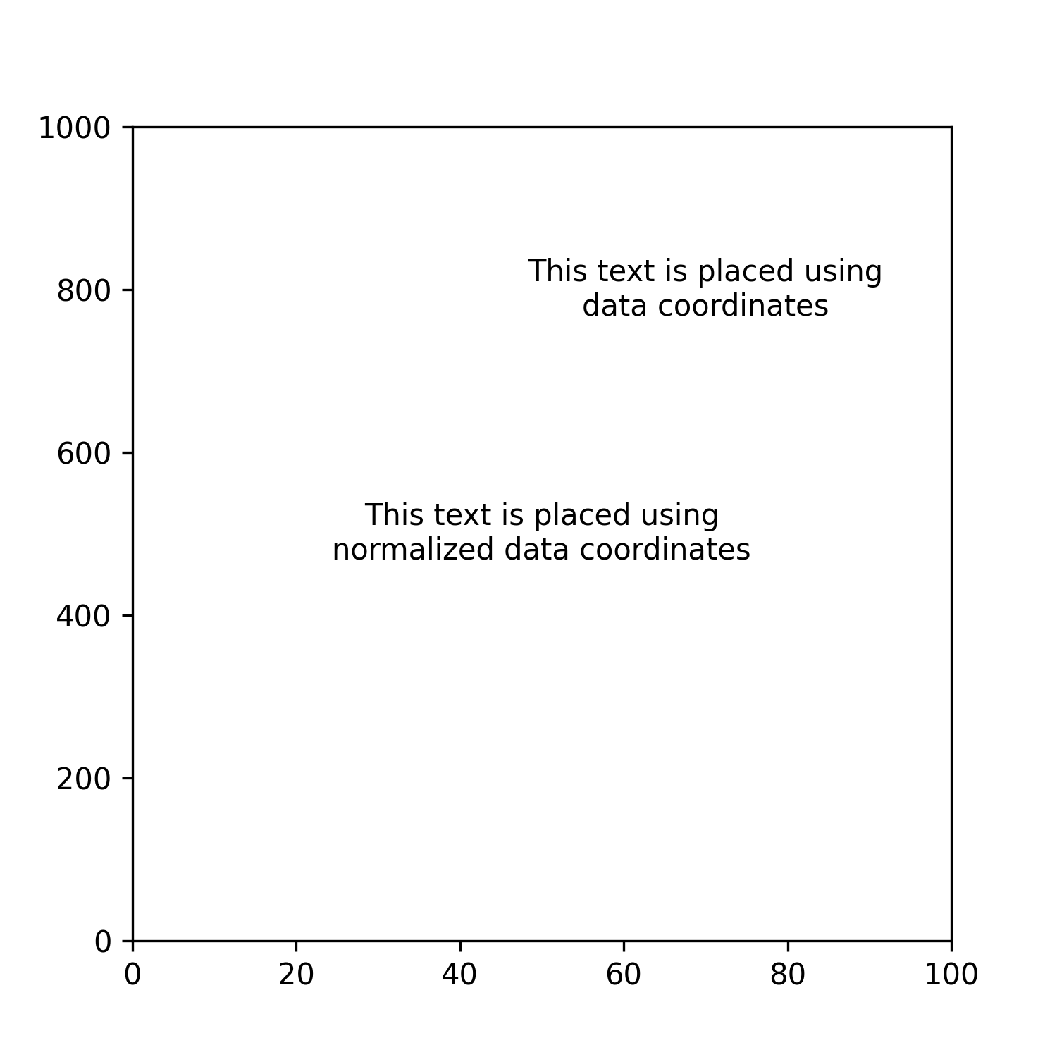
Notice the difference between the two annotations?
In the first one, I'm using matplotlib's default coordinate system to place an annotation – the data coordinate system – which is based on the underlying data of our plot, i.e., the xy=(70, 800) position in the axes.
On the other hand, for the second annotation, I'm telling matplotlib to interpret the (x,y) coordinates supplied as normalized data coordinates. This is done by adding the xycoords parameter to the method and passing it the "axes fraction" argument. By inputting xy=(0.5, 0.5), I'm telling matplotlib to place the annotation in the center of our axes regardless of the x and y limits.
The Figure Coordinate System
Matplotlib's figure coordinate system is specified in terms of pixels (in its native version) and maps the width and height of the figure to a scale of 0 to 1 in its normalized version.
Similar to the data coordinate system, figure coordinates provide a useful method to place certain elements of our plot, depending on the use case. Let's look at a simple example.
'''
A figure of dimensions of 5 inches wide and 5 inches high
Dots per inch of 300 (dpi) -- these are equivalent to pixels
So our figure is 1500 x 1500 pixels.
'''
fig = plt.figure(figsize=(5,5), dpi=300)
ax = plt.subplot()

ax.annotate(
    xy=(750,750),
    text='I\'m at the center\nof the figure' ,
    xycoords='figure pixels',
    ha='center',
    va='center'
)

ax.annotate(
    xy=(.5,.4),
    text='I\'m just slightly below the center\nof the figure' ,
    xycoords='figure fraction',
    ha='center',
    va='center'
)

plt.savefig(
    'figures/figure_coordinates.png',
    dpi=300,
    transparent=True
)
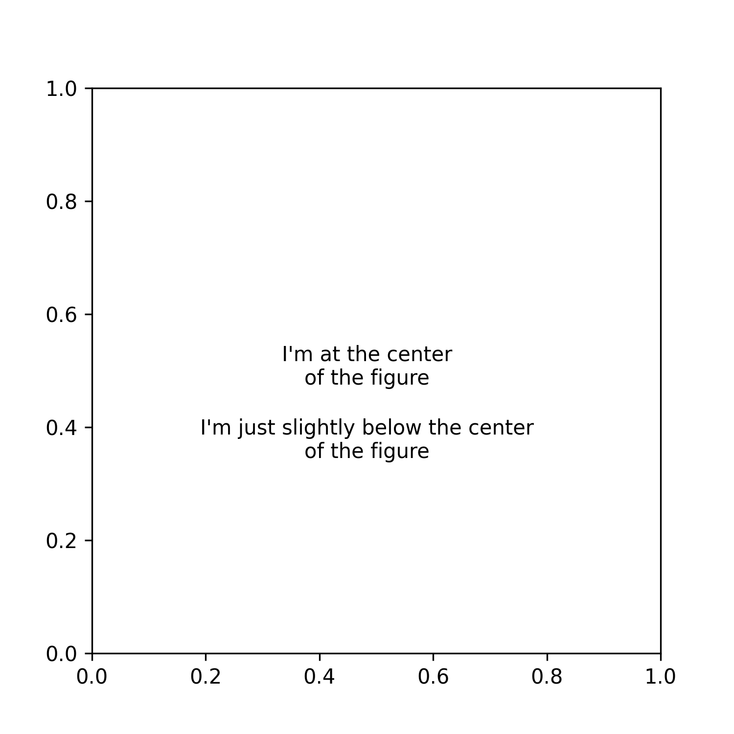
Notice that in the previous example, the first annotation is placed precisely at the center of the figure (not the axes) and that the x and y coordinates are given in terms of pixels. On the other hand, the second annotation is specified in terms of normalized figure coordinates (from 0 to 1) – which, although similar, is not the same as normalized data coordinates.
That's why knowing the dimensions of the figure (in pixels) can come in handy 😉.
📝 Excercise
Play with the previous code by changing the limits of the x and y axes and notice how the position of the annotations remains the same.
Transforms & Coordinates in Practice
In this section, we'll explore a specific use case where you might need to use different coordinate systems to achieve certain results. Also, we'll briefly explore transformation methods that allow you to switch between coordinate systems with "ease".
Please note that you don't need to know these methods by heart, you should only know that they exist and that they're available to help you achieve magical results.
Logos as Scatter Plots
You might have seen from my previous posts, that I usually use some "mysterious" functions to add the logo of teams at certain locations in the visual.
In this example, we'll look at this in detail and the underlying "how's" behind them.
We being by defining a function that takes the Fotmob team_id and returns the image at the specified axes.
def ax_logo(team_id, ax):
    '''
    Plots the logo of the team at a specific axes.
    Args:
        team_id (int): the id of the team according to Fotmob. You can find it in the url of the team page.
        ax (object): the matplotlib axes where we'll draw the image.
    '''
    fotmob_url = 'https://images.fotmob.com/image_resources/logo/teamlogo/'
    club_icon = Image.open(urllib.request.urlopen(f'{fotmob_url}{team_id:.0f}.png'))
    ax.imshow(club_icon)
    ax.axis('off')
    return ax
💡 Please note that for this example we'll use random data for illustrative purposes only.
Great. Now that we have the function to retrieve a logo, let's take a look at two different transformation methods.
First, we have the ax.transData.transform method which takes data coordinates and transforms them into figure coordinates, a.k.a pixels. Then, we have the fig.transFigure.inverted().transform method which takes figure coordinates (pixels) and transforms them into normalized figure coordinates – that is, the relative position within the figure.
An important thing to mention here is that since both of these methods come from the figure ( fig ) and axes ( ax ) objects they need to be called once the figure and axes have been defined.
We begin by exploring a simple example, and build up from there.
fig = plt.figure(figsize=(5,2), dpi=300)
ax = plt.subplot(111)

ax.set_xlim(0,5)
ax.set_ylim(0,2)

# -- Transformation functions
DC_to_FC = ax.transData.transform
FC_to_NFC = fig.transFigure.inverted().transform

pixel_coords = DC_to_FC((2.5,1))
figure_fraction_coords = FC_to_NFC(pixel_coords)

print(
f'''Data coordinates (x,y) = (2.5,1) in pixels:
({pixel_coords[0]}, {pixel_coords[1]})'''
)
print(
f'''Pixel coordinates (x,y) = ({pixel_coords[0]}, {pixel_coords[1]}) in figure fraction:
({figure_fraction_coords[0]:.2f}, {figure_fraction_coords[1]:.2f})'''
)
Which outputs the following:
>> Data coordinates (x,y) = (2.5,1) in pixels:
(768.75, 297.0)
>> Pixel coordinates (x,y) = (768.75, 297.0) in figure fraction:
(0.51, 0.50)
Can you explain what the code is doing?
If you've been following closely, you'll remember that we can compute the size of our figure with the dpi and figsize, which for this particular example results in a 1500 x 600 sized image. Then, it should come as no surprise that the data points (2.5, 1) – which are at the center of our axes – are mapped close to the center of the figure, i.e. (768.7, 297) in pixels and (0.51, 0.5) in normalized figure coordinates.
📝 Excercise
Comment the lines where I specify the limits of the axes, and run the code once more, can you explain why the mapping of our data points changes?
Ok, enough of empty boring figures. It's time to get our hands dirty and plot some logos.
For starters, let's generate some random data points.
np.random.seed(120)
x_loc = np.random.uniform(0.1,.9,10)
y_loc = np.random.uniform(0.1,.9,10)
Great. Now, read the code below carefully and try to make sense of what's happening.
fig = plt.figure(figsize=(5,5), dpi=300)
ax = plt.subplot()

ax.set_xlim(0,1)
ax.set_ylim(0,1)

# -- Transformation functions
DC_to_FC = ax.transData.transform
FC_to_NFC = fig.transFigure.inverted().transform
# -- Take data coordinates and transform them to normalized figure coordinates
DC_to_NFC = lambda x: FC_to_NFC(DC_to_FC(x))

ax_size = 0.05

for x,y in zip(x_loc, y_loc):
    ax_coords = DC_to_NFC((x,y))
    fig.add_axes(
        [ax_coords[0] - ax_size/2, ax_coords[1] - ax_size/2, ax_size, ax_size],
         fc='None'
    )

ax.scatter(x_loc, y_loc, zorder=3)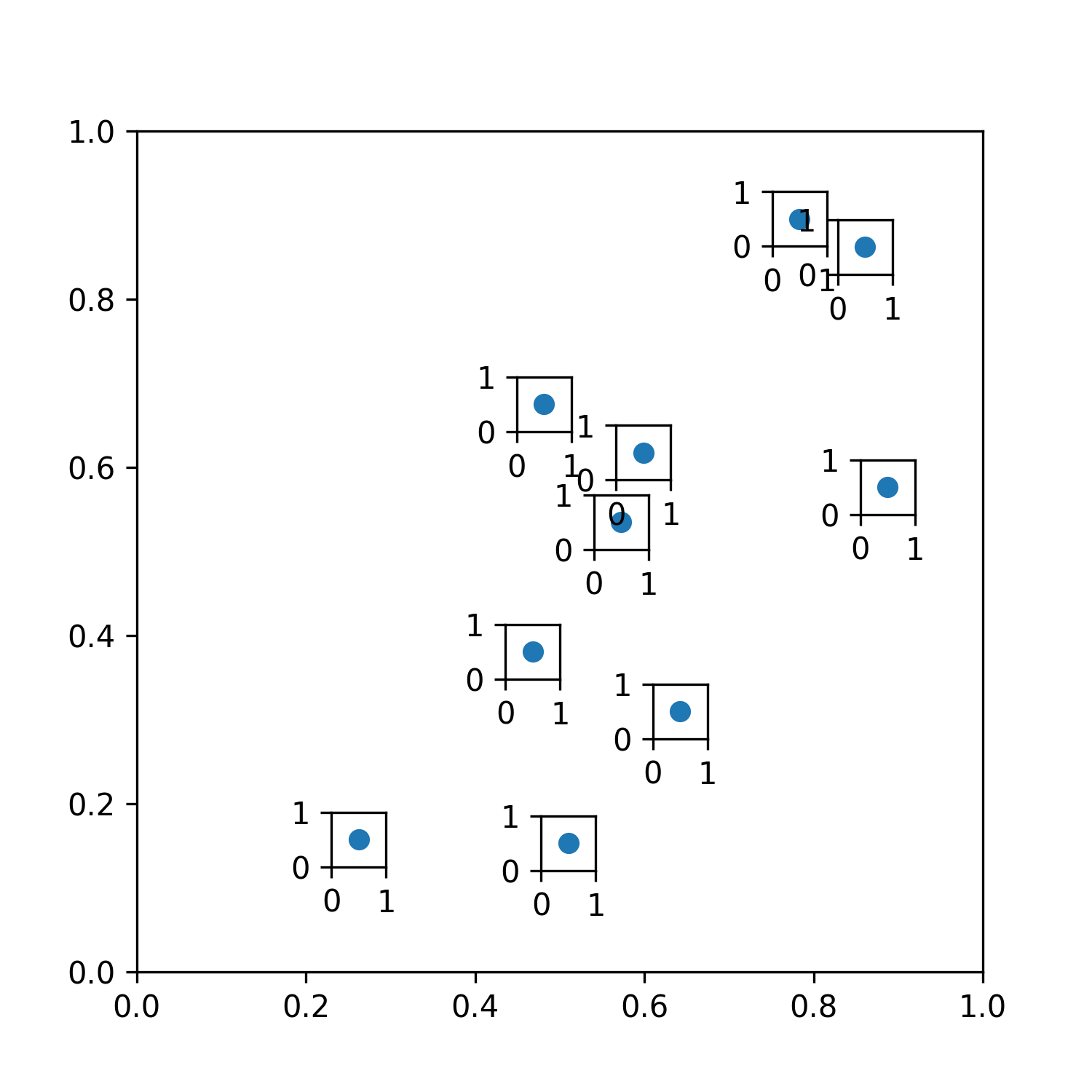
Here's what we did:
- We declared the
DC_to_NFCfunction which first takes data coordinates and turns them into pixels. Then, it transforms those points into normalized figure coordinates – which is the natural way of adding newaxesvia theadd_axesmethod. - Next, we iterate over our data points and use our
DC_to_NFCfunction to map them into normalized figure coordinates. This adds a bunch of newaxeswith their bottom-left corner at the specified location. - However, since we want our (logo)
axesto be centered, we need to adjust the position using relative figure coordinates, so we subtract half the width and height (defined as theax_sizevariable) to center the position.
Let that sink in for a minute.
All good? Let's move on.
The final step consists of drawing the logos to our multiple new axes. This should be quite simple since we've already defined a function that does that for us.
So, let's add 10 random club IDs from Fotmob to plot their crests.
clubs = [
    4616,
    210173,
    8044,
    9991,
    9860,
    8003,
    8695,
    8654,
    9731,
    10154
]
fig = plt.figure(figsize=(5,5), dpi=300)
ax = plt.subplot()
ax.set_xlim(0,1)
ax.set_ylim(0,1)
# -- Transformation functions
DC_to_FC = ax.transData.transform
FC_to_NFC = fig.transFigure.inverted().transform
# -- Take data coordinates and transform them to normalized figure coordinates
DC_to_NFC = lambda x: FC_to_NFC(DC_to_FC(x))
ax_size = 0.05
counter = 0
for x,y in zip(x_loc, y_loc):
ax_coords = DC_to_NFC((x,y))
image_ax = fig.add_axes(
[ax_coords[0] - ax_size/2, ax_coords[1] - ax_size/2, ax_size, ax_size],
fc='None'
)
ax_logo(clubs[counter], image_ax)
counter += 1
plt.savefig(
'figures/scatter_logo_axes_figure.png',
dpi=300,
transparent=True
)Amazing, right? 🤗
📝 Excercise
A good way to test your skills would be for you to try and create the following visual.
There you have it!
Let's do a brief recap:
- Matplotlib has multiple coordinate systems which can be used simultaneously within figures. The two most important ones are figure and data coordinates, and both of them can be used in "normalized" terms.
- Figure coordinates are natively expressed in pixels. You can calculate the pixel dimensions of your plot by multiplying the
dpiand thefigsize. - You can interchange between coordinate systems using transforms. However, it's best to only use them once the dimensions of the figure & axes have been defined, to avoid unexpected results.
- You can add
axesanywhere you wish on your figure which gives supreme flexibility to add images or plots within plots in your visual.
As I mentioned, the goal of this tutorial was to shed some light on the different coordinate systems you can use in matplotlib. So, I really hope you've learned something new.
You can expect a new edition of this series of tutorials every two (or three) weeks until we cover the very basics of matplotlib. So if you'd like to receive updates, make sure you're subscribed to the newsletter.
Please let me know on Twitter if this has helped you in any way, or if there's something that might be confusing – it really does help to create better content.
Thanks for reading.
Catch you later 👋


