


Rolling average \(\mathrm{xG}\) charts are amongst my favorite visuals to assess a football team's performance across the season.
The main benefits of these types of charts are that: 1) they're simple to understand and 2) data can be easily collected from the internet.
The goal of this tutorial will be to show you a step-by-step method on how to create a \(\mathrm{xG}\) rolling chart using matplotlib.
What we'll need
First of all, this tutorial assumes that you already have at least some basic understanding of matplotlib and pandas.
To start, let's import the libraries that will be required throughout the course of this post. Please make sure you install the highlight_text package in case you want to easily add colors to the text of our visual.
Note: if you're using Google Colab you should run the following line at the top of your notebook, to ensure we're using the same matplotlib version.
!pip install matplotlib --upgradeimport pandas as pd
import matplotlib.pyplot as plt
import matplotlib.ticker as ticker
from highlight_text import fig_textThe data
Brighton was one of my favorite teams to follow in the Premier League during the 2021/2022 season. So, we'll be using their \(\mathrm{xG}\) for this particular example.
You can download the csv file – which contains expected goal data from the 2020/2021 and 2021/2022 seasons – from the following link:
df = pd.read_csv("brighton_xg_soc_tutorial_06092022.csv")Our data will look something like this:
|    | home_team_name         | away_team_name         |   home_team_xG |   away_team_xG | date                |
|---:|:-----------------------|:-----------------------|---------------:|---------------:|:--------------------|
|  0 | Brighton & Hove Albion | Manchester United      |           2.55 |           1.55 | 2020-09-26 06:30:00 |
|  1 | Brighton & Hove Albion | West Bromwich Albion   |           0.5  |           0.35 | 2020-10-26 11:30:00 |
|  2 | Tottenham Hotspur      | Brighton & Hove Albion |           1.75 |           0.3  | 2020-11-01 13:15:00 |
|  3 | Everton                | Brighton & Hove Albion |           1.6  |           1.35 | 2020-10-03 09:00:00 |
|  4 | Brighton & Hove Albion | Chelsea                |           1.05 |           1.22 | 2020-09-14 14:15:00 |
Now that we have the data, the goal is to transform it into a format that's easy to input into our matplotlib visualization.
The main trick here is that we need to create a series for both expected goals created and conceded regardless if the team played at home or away.
The best way to do this, in my opinion, is to create a new DataFrame with six columns: team, opponent, variable, value, venue and date.
To achieve this, we'll split our df into two and then concatenate them back together. Also, by adding the venue column we could even deepen our analysis to only consider home or away performance.
home_df = df.copy()
home_df = home_df.melt(id_vars = ["date", "home_team_name", "away_team_name"])
home_df["venue"] = "H"
home_df.rename(columns = {"home_team_name":"team", "away_team_name":"opponent"}, inplace = True)
home_df.replace({"variable":{"home_team_xG":"xG_for", "away_team_xG":"xG_ag"}}, inplace = True)
We repeat the process for the away data.
away_df = df.copy()
away_df = away_df.melt(id_vars = ["date", "away_team_name", "home_team_name"])
away_df["venue"] = "A"
away_df.rename(columns = {"away_team_name":"team", "home_team_name":"opponent"}, inplace = True)
away_df.replace({"variable":{"away_team_xG":"xG_for", "home_team_xG":"xG_ag"}}, inplace = True)
And join it back together.
df = pd.concat([home_df, away_df]).reset_index(drop = True)In the end, your df should look something like this:
|    | date                | team                   | opponent               | variable   |   value | venue   |
|---:|:--------------------|:-----------------------|:-----------------------|:-----------|--------:|:--------|
|  0 | 2020-09-26 06:30:00 | Brighton & Hove Albion | Manchester United      | xG_for     |    2.55 | H       |
|  1 | 2020-10-26 11:30:00 | Brighton & Hove Albion | West Bromwich Albion   | xG_for     |    0.5  | H       |
|  2 | 2020-11-01 13:15:00 | Tottenham Hotspur      | Brighton & Hove Albion | xG_for     |    1.75 | H       |
|  3 | 2020-10-03 09:00:00 | Everton                | Brighton & Hove Albion | xG_for     |    1.6  | H       |
|  4 | 2020-09-14 14:15:00 | Brighton & Hove Albion | Chelsea                | xG_for     |    1.05 | H       |
For the final step of this section, we'll filter the records related to Brighton and compute the rolling average for the expected goals data.
# Filter Brighton data
df = df[df["team"] == "Brighton & Hove Albion"].reset_index(drop = True)
df = df.sort_values(by = "date")

# xG conceded and xG created
Y_for = df[df["variable"] == "xG_for"].reset_index(drop = True)
Y_ag = df[df["variable"] == "xG_ag"].reset_index(drop = True)
X = pd.Series(range(len(Y_for)))

# Compute the rolling average (min_periods is used for the partial average)
# Here we're using a 10 game rolling average
Y_for = Y_for.rolling(window = 10, min_periods = 0).mean()
Y_ag = Y_ag.rolling(window = 10, min_periods = 0).mean()
The chart
All right, now that we have the data we can go ahead and start plotting.
Essentially, what we are doing here is a simple line chart. However, the focus of this tutorial will be on taking our visual past the defaults and adding a ton of customization to give it an aesthetically pleasing style.
Let's begin by doing the most basic visual possible.
fig = plt.figure(figsize=(4, 2.5), dpi = 200)
ax = plt.subplot(111)

ax.plot(X, Y_for, label = "xG created")
ax.plot(X, Y_ag, label = "xG conceded")

ax.legend()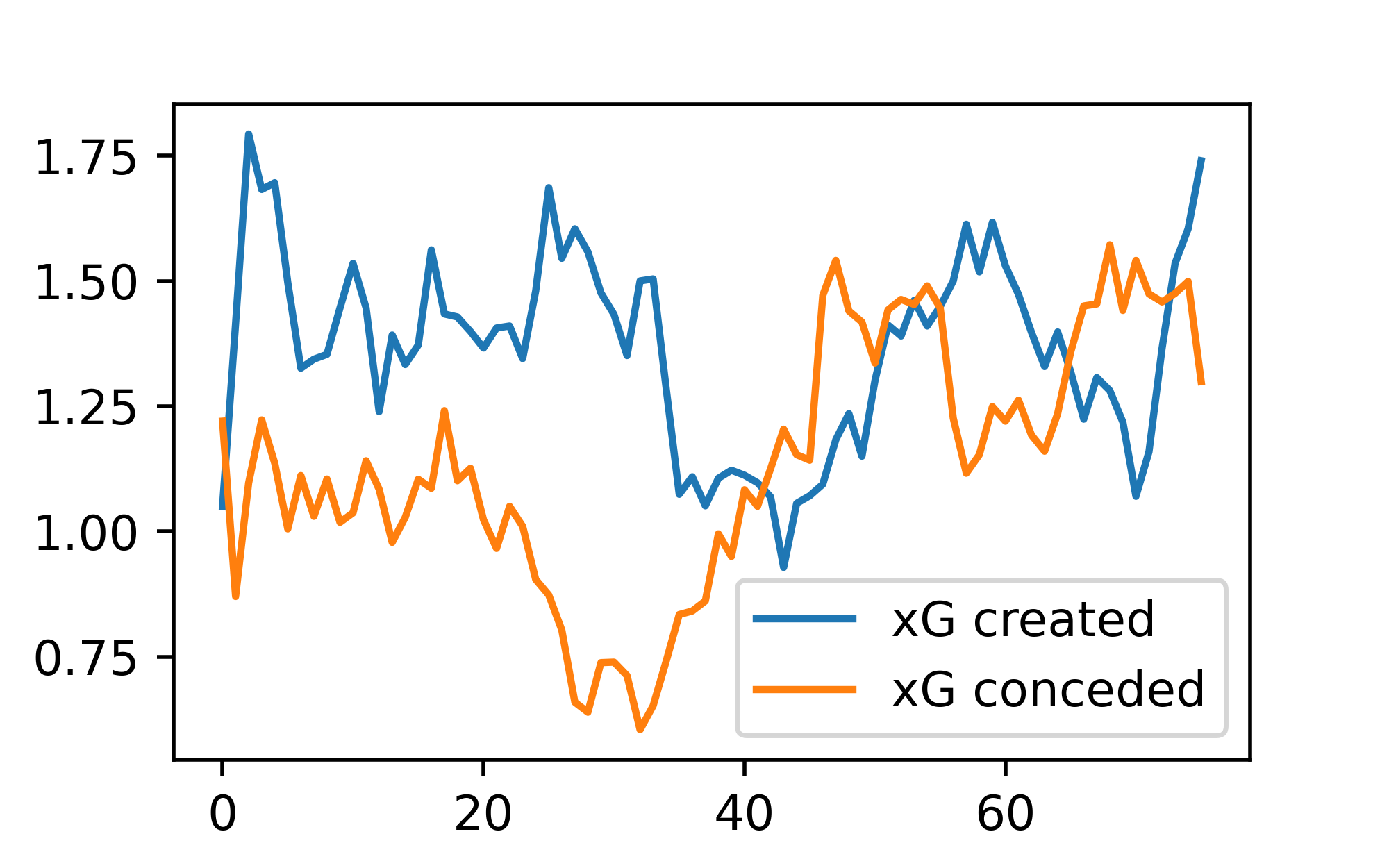
Customizing ticks, grids, and spines
A good place to start if you want to gain a better understanding of the anatomy of a matplotlib visualization is to go ahead to their documentation and take a close look at the code and output presented on this page.
We'll start by styling the ticks and spines of our figure to give it a more minimalistic look. Here's how we do this:
fig = plt.figure(figsize=(4, 2.5), dpi = 200)
ax = plt.subplot(111)

# Remove top & right spines and change the color.
ax.spines[["top", "right"]].set_visible(False)
ax.spines[["left", "bottom"]].set_color("grey")

# Set the grid
ax.grid(
    visible = True,
    lw = 0.75,
    ls = ":",
    color = "lightgrey"
)

ax.plot(X, Y_for, label = "xG created")
ax.plot(X, Y_ag, label = "xG conceded")

# Customize the ticks to match spine color and adjust label size.
ax.tick_params(
    color = "grey",
    length = 5,
    which = "major",
    labelsize = 6,
    labelcolor = "grey"
)

# Set x-axis major tick positions to only 19 game multiples.
ax.xaxis.set_major_locator(ticker.MultipleLocator(19))
# Set y-axis major tick positions to only 0.5 xG multiples.
ax.yaxis.set_major_locator(ticker.MultipleLocator(0.5))
ax.set_ylim(0)


ax.legend(fontsize = 6)
Looks cleaner. Right?
Fill between the lines
This one's pretty easy to achieve, all we need to do is call the fill_between method to do the heavy lifting for us.
The only trick lies in specifying the parameter interpolate = True and to pass the condition to the where parameter.
Shoutout to @danzn1 for making me aware of this method!
fig = plt.figure(figsize=(4, 2.5), dpi = 200)
ax = plt.subplot(111)

# Remove top & right spines and change the color.
ax.spines[["top", "right"]].set_visible(False)
ax.spines[["left", "bottom"]].set_color("grey")

# Set the grid
ax.grid(
    visible = True,
    lw = 0.75,
    ls = ":",
    color = "lightgrey"
)

ax.plot(X, Y_for, label = "xG created")
ax.plot(X, Y_ag, label = "xG conceded")

# Fill between
ax.fill_between(
    X,
    Y_ag["value"],
    Y_for["value"],
    where = Y_for["value"] > Y_ag["value"],
    interpolate = True,
    alpha = 0.85,
    zorder = 3
)

ax.fill_between(
    X,
    Y_ag["value"],
    Y_for["value"],
    where = Y_ag["value"] >= Y_for["value"],
    interpolate = True,
    alpha = 0.85
)

# Customize the ticks to match spine color and adjust label size.
ax.tick_params(
    color = "grey",
    length = 5,
    which = "major",
    labelsize = 6,
    labelcolor = "grey",
    zorder = 3
)

# Set x-axis major tick positions to only 19 game multiples.
ax.xaxis.set_major_locator(ticker.MultipleLocator(19))
# Set y-axis major tick positions to only 0.5 xG multiples.
ax.yaxis.set_major_locator(ticker.MultipleLocator(0.5))
ax.set_ylim(0)


ax.legend(fontsize = 6)
Stunner 😍.
Text elements and legends
Adding text can be a great way to make our visuals more informative and eye-catching.
One of my favorite tools to do this is Peter McKeever's and Danzn's highlight_text package, which allows us to easily add colors and customization to our text with very few lines of code.
In this section, I'll share a few tips on how I add text to my figures – a topic which for me was a bit hard to grasp on my initial journey with matplotlib.
The first thing you should be aware of is the type of coordinate system you're using to annotate and add text to your visuals. In essence, matplotlib has four different coordinate systems which you can interchange and transform to gain more control in your visual customization journey, these are data, axes, figure and display coordinates (learn more here).
Although I won't go into detail about this right now, I wanted to at least share with you the difference between the axes and figure coordinate systems, as they become extremely relevant when it comes to placing the text and annotations within your plot. Let's begin by taking a look at the next figure.
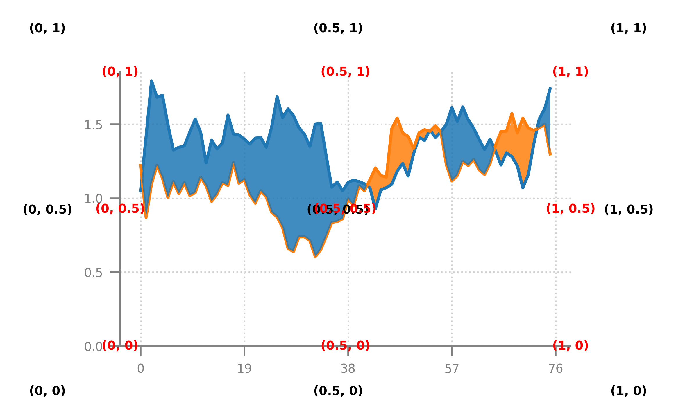
Here the numbers between parentheses denote the \((x,y)\) coordinates for both the figure and axes coordinate systems.
Both systems can be represented in pixels, points, and as a fraction of the canvas. In the previous plot, I used both of them as a fraction of the canvas, that is, they take values from zero to one with a value of \((0,0)\) representing the lower-left corner of the axes or figure (remember that these two are different objects).
The main purpose of using this advanced feature is that it allows us to specify exactly where we want our text to be placed, regardless of the data values contained within the visual. For example, suppose we're interested in placing our title on the upper-left corner of the visual without it interfering with the data. In that case, we can then specify our text to be placed in the \(x = 0\), \(y = 1.05\) position of the figure coordinate system.
In the next code snippet, you'll be able to see how you can specify the coordinate system within the highlight_text package. However, a good rule of thumb is that by default the fig_text() method will use the figure coordinates, whereas the ax_text() method will use data coordinates.
fig = plt.figure(figsize=(4, 2.5), dpi = 200)
ax = plt.subplot(111)

# Remove top & right spines and change the color.
ax.spines[["top", "right"]].set_visible(False)
ax.spines[["left", "bottom"]].set_color("grey")

# Set the grid
ax.grid(
    visible = True,
    lw = 0.75,
    ls = ":",
    color = "lightgrey"
)

line_1 = ax.plot(X, Y_for, zorder = 4)
line_2 = ax.plot(X, Y_ag, zorder = 4)

ax.set_ylim(0)
# Add a line to mark the division between seasons
ax.plot(
    [38,38], # 38 games per season
    [ax.get_ylim()[0], ax.get_ylim()[1]],
    ls = ":",
    lw = 1.25,
    color = "grey",
    zorder = 2
)

# Annotation with data coordinates and offset points.
ax.annotate(
    xy = (38, .55),
    xytext = (20, 10),
    textcoords = "offset points",
    text = "Change in EPL season",
    size = 6,
    color = "grey",
    arrowprops=dict(
        arrowstyle="->", shrinkA=0, shrinkB=5, color="grey", linewidth=0.75,
        connectionstyle="angle3,angleA=50,angleB=-30"
    ) # Arrow to connect annotation
)

# Fill between
ax.fill_between(
    X,
    Y_ag["value"],
    Y_for["value"],
    where = Y_for["value"] >= Y_ag["value"],
    interpolate = True,
    alpha = 0.85,
    zorder = 3
)

ax.fill_between(
    X,
    Y_ag["value"],
    Y_for["value"],
    where = Y_ag["value"] > Y_for["value"],
    interpolate = True,
    alpha = 0.85,
    zorder = 3
)

# Customize the ticks to match spine color and adjust label size.
ax.tick_params(
    color = "grey",
    length = 5,
    which = "major",
    labelsize = 6,
    labelcolor = "grey",
    zorder = 3
)

# Set x-axis major tick positions to only 19 game multiples.
ax.xaxis.set_major_locator(ticker.MultipleLocator(19))
# Set y-axis major tick positions to only 0.5 xG multiples.
ax.yaxis.set_major_locator(ticker.MultipleLocator(0.5))

# Title and subtitle for the legend
fig_text(
    x = 0.12, y = 1.1,
    s = "Brighton & Hove Albion",
    color = "black",
    weight = "bold",
    size = 10,
    annotationbbox_kw={"xycoords": "figure fraction"}
)

fig_text(
    x = 0.12, y = 1.02,
    s = "Expected goals <created> and <conceded> | 10-match rolling average\nEPL seasons 20/21 and 21/22",
    highlight_textprops = [
        {"color": line_1[0].get_color(), "weight": "bold"},
        {"color": line_2[0].get_color(), "weight": "bold"}
    ],
    color = "black",
    size = 6,
    annotationbbox_kw={"xycoords": "figure fraction"}
)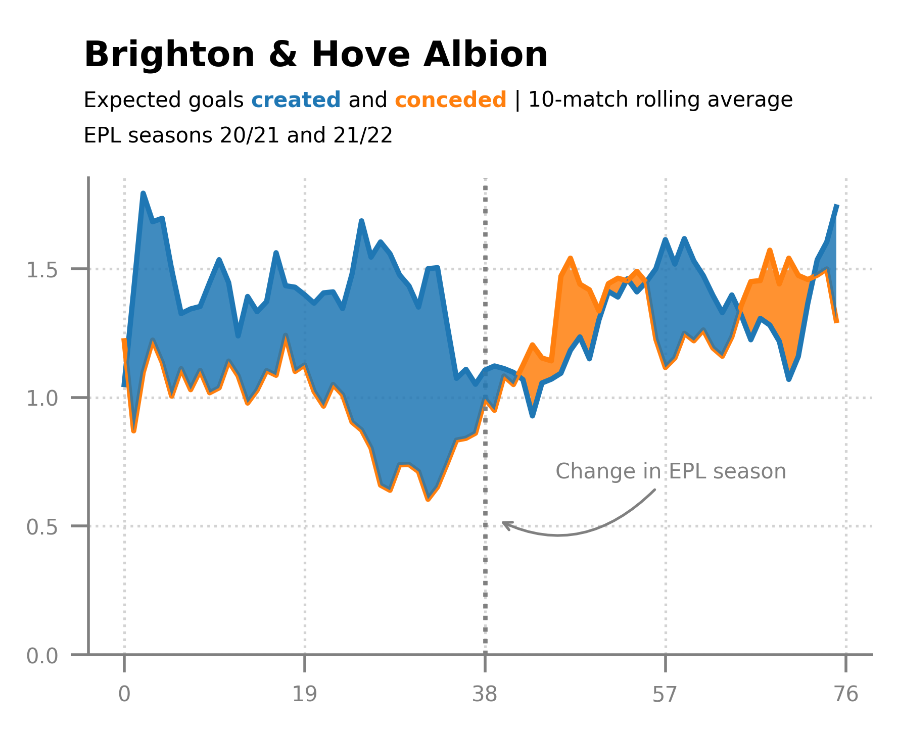
What a beauty!
Final touches
Using a custom font can go a long way in making your plot more visually appealing and it's something I strongly recommend implementing into your own work.
For now, I'll be skipping the details on how to do this since I think that this tutorial has become a bit longer than I initially intended.
However, I will reveal one of my best-kept secrets (at least I think it is, lol). Adding logos to plots effortlessly – that is, without going through the process of downloading every single image from the web.
To achieve this, we'll "scrape" Fotmob's website (please don't tell them 🙃) and plot the image directly into our visual. The only things we'll need for this are the urllib and PIL packages.
from PIL import Image
import urllib
After you've imported those packages the last thing left to do is create a new axes object to draw the image. For this, we'll be using the add_axes() method which you can learn more about here.
fotmob_url = "https://images.fotmob.com/image_resources/logo/teamlogo/"

logo_ax = fig.add_axes([0.01, .95, 0.11, 0.11], zorder=1)
club_icon = Image.open(urllib.request.urlopen(f"{fotmob_url}10204.png"))
logo_ax.imshow(club_icon)
logo_ax.axis("off")
What we're doing here is we're creating a new axes object and drawing the image inside of it. The cool thing is that we're getting the image directly from the web and don't have to download the image locally, you only need to know the url of where the image is stored in Fotmob (I'll let you figure out the final details on your own).
Let's look at the final code and output.
fig = plt.figure(figsize=(4.5, 2.5), dpi = 200, facecolor = "#EFE9E6")
ax = plt.subplot(111, facecolor = "#EFE9E6")

# Remove top & right spines and change the color.
ax.spines[["top", "right"]].set_visible(False)
ax.spines[["left", "bottom"]].set_color("grey")

# Set the grid
ax.grid(
    visible = True,
    lw = 0.75,
    ls = ":",
    color = "lightgrey"
)

line_1 = ax.plot(X, Y_for, color = "#0057B8", zorder = 4)
line_2 = ax.plot(X, Y_ag, color = "#989898", zorder = 4)

ax.set_ylim(0)
# Add a line to mark the division between seasons
ax.plot(
    [38,38], # 38 games per season
    [ax.get_ylim()[0], ax.get_ylim()[1]],
    ls = ":",
    lw = 1.25,
    color = "grey",
    zorder = 2
)

# Annotation with data coordinates and offset points.
ax.annotate(
    xy = (38, .55),
    xytext = (20, 10),
    textcoords = "offset points",
    text = "Change in EPL season",
    size = 6,
    color = "grey",
    arrowprops=dict(
        arrowstyle="->", shrinkA=0, shrinkB=5, color="grey", linewidth=0.75,
        connectionstyle="angle3,angleA=50,angleB=-30"
    ) # Arrow to connect annotation
)

# Fill between
ax.fill_between(
    X,
    Y_ag["value"],
    Y_for["value"],
    where = Y_for["value"] >= Y_ag["value"],
    interpolate = True,
    alpha = 0.85,
    zorder = 3,
    color = line_1[0].get_color()
)

ax.fill_between(
    X,
    Y_ag["value"],
    Y_for["value"],
    where = Y_ag["value"] > Y_for["value"],
    interpolate = True,
    alpha = 0.85,
    color = line_2[0].get_color()
)

# Customize the ticks to match spine color and adjust label size.
ax.tick_params(
    color = "grey",
    length = 5,
    which = "major",
    labelsize = 6,
    labelcolor = "grey",
    zorder = 3
)

# Set x-axis major tick positions to only 19 game multiples.
ax.xaxis.set_major_locator(ticker.MultipleLocator(19))
# Set y-axis major tick positions to only 0.5 xG multiples.
ax.yaxis.set_major_locator(ticker.MultipleLocator(0.5))

# Title and subtitle for the legend
fig_text(
    x = 0.12, y = 1.1,
    s = "Brighton & Hove Albion",
    color = "black",
    weight = "bold",
    size = 10,
    family = "DM Sans", #This is a custom font !!
    annotationbbox_kw={"xycoords": "figure fraction"}
)

fig_text(
    x = 0.12, y = 1.02,
    s = "Expected goals <created> and <conceded> | 10-match rolling average\nEPL seasons 20/21 and 21/22",
    highlight_textprops = [
        {"color": line_1[0].get_color(), "weight": "bold"},
        {"color": line_2[0].get_color(), "weight": "bold"}
    ],
    color = "black",
    size = 6,
    annotationbbox_kw={"xycoords": "figure fraction"}
)

fotmob_url = "https://images.fotmob.com/image_resources/logo/teamlogo/"

logo_ax = fig.add_axes([0.75, .99, 0.13, 0.13], zorder=1)
club_icon = Image.open(urllib.request.urlopen(f"{fotmob_url}10204.png"))
logo_ax.imshow(club_icon)
logo_ax.axis("off")
There you have it! 🤩
If you enjoyed this tutorial, please help me out by subscribing to my website and sharing my work. Hope this was useful to you in some way.
Catch you later 👋


